What’s my LTV?

Lifetime value is an important marketing concept which describes the amount of money a business can expect earn from a customer.  For this post, I’ve decided to calculate how much I’m worth to a business over the last 12 months using all my spending using Mint.com.


Business Analysis

I was really interested in the businesses where I spend the most money.  For this analysis, I have three categories essential expenses costs (rent, public transport, phone, groceries), and non-essential expenses (alcohol, coffee, fast food).  I’ll ignore the essential expenses because nobody really cares that I spend the same amount every month with the MTA or Verizon.   Below is a handpicked list of businesses that I spent lots of money at last year.

BLACK STAR COFFEE, $1,025: The business that surprised me the most was Black Star Coffee.  The average meal for me is a croissant, and a double cortado on weekdays, and a siracha egg sandwich and iced coffee on weekends.  Before looking at the data, I expected my monthly spending to be around $40.   Using Mint, I saw that over the last 12 months, I spent over $1,000 on 136 purchases (average cost of $7.54).  Clearly I was way off, I was blindly handing my credit card over without actually doing the math in my head, of how often I frequented this coffee place.

I like their croissants, and breakfast sandwiches a lot, I highly encourage people to try it out.  But I can’t justify spending at a conservative estimate, $400 a year on coffee from one place.  I could buy a coffee machine for $40, and pay an average of $0.40 for a freshly brewed cup of coffee, saving myself around $3.50 per cup.

TRADER JOES WINE SHOP, $409: Over the last year, I’ve really gotten into Trader Joe’s “two buck chuck”, officially known as Charles Shaw Wine, which is available for $3 for one bottle.  From the data, I make a bi-monthly trip to the Trader Joes wine shop, where I pick up two bottles  the first is usually an $8 Malbec, and the second is either a bottle of two buck chuck, or a second $8 Malbec, all of which leaves me with an average basket of $16.35 (incl. 10% NYC tax).

I expected my spending to be much higher with Trader Joes Wine, I was under the impression I visited more often and spent more in an average visit.  In terms of cost reduction, there’s not much I can except stop drinking.  In my opinion the wine is a great value, it doesn’t taste like it’s two dollars and it’s better than most beer.

Seamless, $714: I was really worried that Seamless would be over $1,000.  I estimated that my average basket was between $18 – $21 (actually $19.85), and that I ordered around 50 times (actually 36 times).  I’m fairly loyal, 2 restaurants accounted for 44% of all orders.  Half of all orders came in the final three months of 2016, while the other half came over the next nine months.  It’s good to know that I learned self control

One interesting to note, in 2016 I spent $979 on 52 orders, I’m not proud of it, but it was so convenient.

Category Analysis:


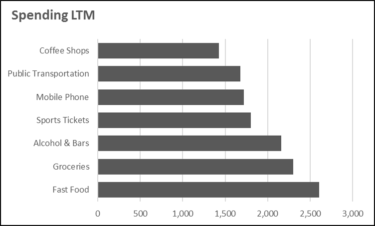
Fast Food $2,606: This is pretty embarrassing for two reasons. First these costs are mostly avoidable if I brought lunch, or stopped using Seamless.  Bringing lunch twice a week could save $1,000.  Second, I spent less on groceries than fast food.  Every time I buy lunch, I spend an average of $10.47, but cooking at home could cost me around $2 – $3 which is an 80% decrease in costs.

Sports Tickets $1,804: I’m a huge sports fan, over the past 12 months I went to the French Open, US (Tennis) Open, NHL Rangers games, and several soccer games.  Over the next 12 months I expect this to remain the same or slightly increase because I’d like to attend more NHL games, and an NFL game.  It’s not cheap, I spend around $150 dollars on each event (excl. soccer).

Television and Streaming $549: I use Sling TV, HBO Now, and Netflix Streaming for all of my TV and streaming.

Does this satisfy all my viewing needs?  Technically yes, the only thing I’m missing certain sports networks like YES, FS1 and MSG.  The channels that I do watch live are available in Sling and HBO Now: ESPN, Comedy Central, Adult Swim, HBO, and I can watch certain sports using a $15 (one time cost) digital TV antenna.

For comparison, using cable like Spectrum I could pay around $130/month, putting my total spend to $1,560 + $203 from Netflix.


Next Steps

Some areas were eyeopening.  I spend way too much on greasy Seamless food and lunch.  If I do spend money, it should be on nicer restaurants that I visit with friends.  Coffee was another unnecessary expense that I regret.  Coffee was usually ordered with a snack or sandwich which often doubled the cost.  For the next 12 months I should focus on brewing my own coffee, eating out less for dinner and bringing my lunch which could easily save me $1,000.  One area that I don’t expect to change, is sports tickets and alcohol.  I really enjoy seeing sports live and I don’t expect to change that anytime soon.  I would like to spend less than $2,000 over the next year, but realistically with dates, happy hours and NYC’s obsession with cocktail bars it will be hard.  I think it makes sense to track these expenses closer in Mint.  I’ve set up budgets which I’m trying to follow a little more closely, and I’ll try and do a quarterly post-mortem of expenses to see if I followed through on the cost reductions.


Source: Mint, Excel used for Viz

5,800 years of data from The Metropolitan Museum of Art

One a cold Tuesday in February, The Metropolitan Museum of Art quietly released data and images on it’s entire collection to the public.  With over 200,000 pieces in it’s collection, The Met is the largest Museum in the Western Hemisphere, and contains relics from 3,800 B.C.

I’m a member of the Met, and try to visit ever 5-6 months.  While I enjoy the experience, one concerning theme that I noticed with this dataset was the lack of data governance.  While it’s understandable that certain pieces would be missing information due to age and lack of record keeping, I found lot’s of objects missing basic data.  In some cases, when the person categorizing the data wasn’t sure, they added a “(?)” after the name.

Country of origin

79% of the pieces in the collection don’t have a country listed

57% don’t have an artist name (not including objects attributed to anonymous)

10% don’t have a classification (ie: Print, Drawings, Ceramic)

The Met has more than paintings

  • 6.8% of pieces are silk
  • 4.5% are etchings
  • 3.7% are Photos

Top Artists at the Met

  • 57% of pieces don’t have an artist listed
  • 2,908 pieces from Allen & Ginter (mostly cards from a tobacco company)
  • 314 Rembrandt
  • 24 Van Gogh
  • 23 Pollock
  • 16 Michelangelo

Conclusion

When I heard that the Met had released it’s data to the public I was excited because I though this was an opportunity to find interesting facts and trends on the different pieces.  What I found was missing datapoints, and inconsistent data that made the dataset difficult to navigate.  I think my next option is to throw this into Python and clean up the data.  I’ll continue to look into the data more and hopefully will have a better post in the future.

Data Sources:

The Metropolitan Museum of Art via Google Bigquery 

Microsoft Excel for visualization

Become a Met Member

Analyzing 99 Million Taxi Trips Using Chicago Open Data

The City of Chicago released a dataset containing 100M trips over four years and it’s a huge win for the Open Data community. In this post, we examine the dataset which tells us everything about a passenger’s journey through Chicago, and see dive into the data to see how the industry is beginning to decline as competition from “Ride Shares”, begin to enter the market.

What’s does the average Chicagoan Tip their taxi driver?

Typically, 21% and that’s been stable since 2013.  Riders do seem to be more generous in December, with 2015 and 2016 having an average of 22% or higher.

Average Monthly Tip % from 2013-2016
What do people normally tip?

In statistics, a dataset has a “normal distribution” when the mean = median = mode,  in normal terms that means the average = middle number in a dataset = number appearing the most.  From the graph above, we see that it doesn’t have the smoothness of a bell curve, but instead, has sharp spikes around the values of 0%, 20%, 25% and 30%.

From my experience with New York Yellow Taxi Cabs, I assume that the payment system presents passengers with a predefined tip amount when paying.  Based on my analysis, 39% of all passengers use a predefined amount, with non-tippers making up 7% of all rides, and tippers (using the 20/25/30 amount) making up 32% of rides.

Note: Tip amounts in the dataset were only available for passengers who used a credit card.

 How are passengers paying for their ride?

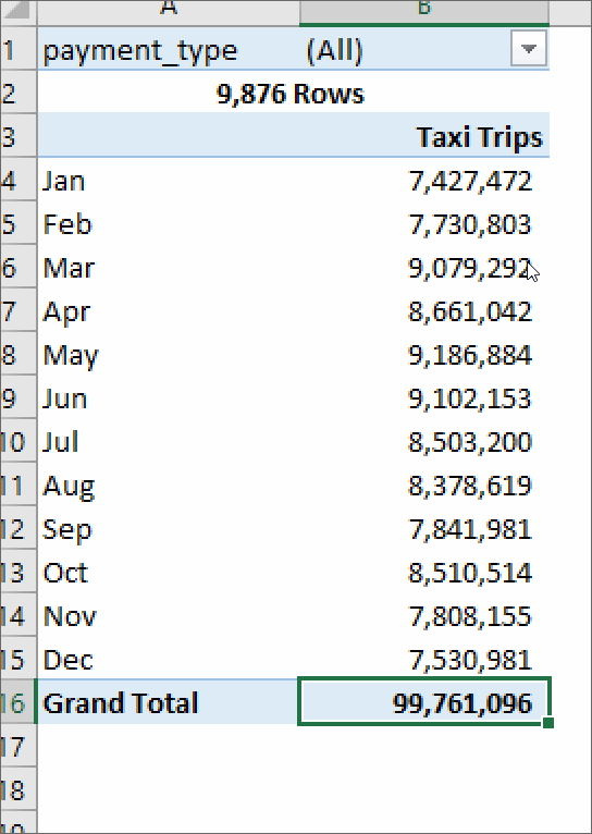
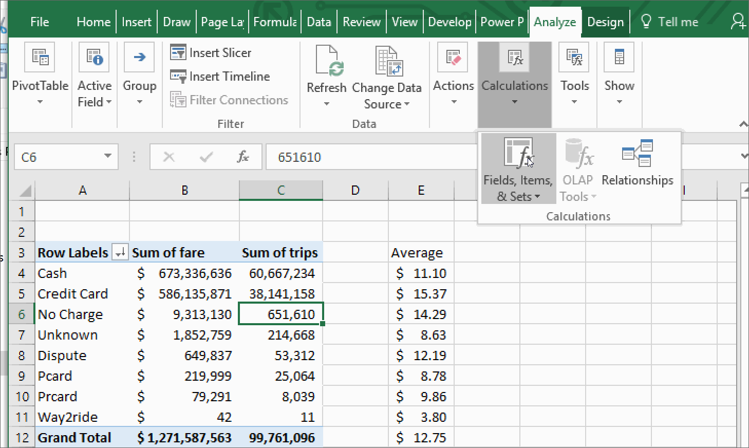
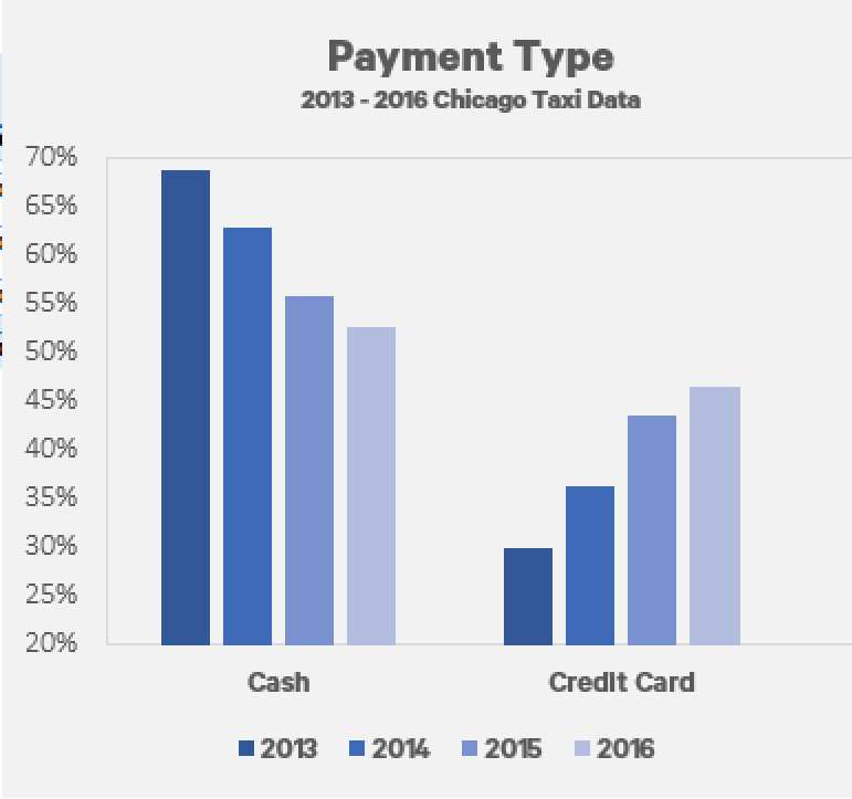
There has been a steady increase in the amount of taxi rides that use a credit card.  From January 2013 to December 2016, the amount of trips using a credit card has increased from 30% to 47%.

Fewer people are using taxis.

2016 was the worst year for the Chicago Taxi industry with only 19.8M rides, the lowest in four years, and 26% lower than 2013.  Interestingly this didn’t have a huge effect on total fares, while trips were down 26%, fares are dropped 18%.  Similarly, while trips are down 10% from 2015, fares have only dipped 1%.

Putting on my economics hat to investigate this decrease, one possible reason for the decrease could be that riders are substituting taxis for ride sharing apps like Uber or Lyft which provide the same service at an equal or lower price.  Or perhaps it’s the January 2016 fare increase of 15%, that has driven consumers away.  In fairness, a 15% increase in Price and a 10% decrease in Quantity would suggest that the demand is slightly inelastic, but I digress. Other less likely reasons could be changes in public transportation, bikeshare programs, or more walking.

How fast does a taxi travel?

How long does a passenger spend in a taxi?

I found an interesting trend in average trip duration which seems to follow a seasonal trend. The winter months tend to have a shorter trip duration.  With a brutal winter, many passengers likely opt to take a taxi for shorter distances than they would in summer months.

Average time a taxi was in service

Average Monthly Fare

Similar to the average trip duration, the average fare follows a similar trend.  Winter months have a lower overall fare than the summer months.  January seems to be consistently 10% lower than May for each year in the dataset.


Conclusion

The Chicago Taxi business is in decline and has seen +10% decreases for two consecutive years.  The introduction of competition from ride share apps like Uber and Lyft has surely eaten into their business and will continue to increase market share as their businesses expand.  From a data perspective we found interesting stats on tip percentage, speed, and ride duration while also witnessing the affects of weather on how the city commutes.  This was an interesting dataset, and I want to look closer into the effects of how neighborhoods pickup/ dropoffs, but first I have to learn about Chicago neighborhoods (or do they have buroughs like NYC?).  My next steps will be to compare NYC to Chicago to see how each city’s taxi compares to the others.

Sources:

Big thanks to the City of Chicago (and more specifically Freedom of Information Laws) which released taxi ridership data into the public domain, and another bigger thanks to Google for adding this into the Big Query dataset and allowing users access to query the information and use it for free.  Chicago, NYC and several other datasets can be found in their database.

Data Sources: Taxi Data via Google Big Query

Code and queries: I need to set up a Github link with code used to generate these queries.

Visualizations Sources: Graphs created using Microsoft Excel.

There are 10,665 people in America named Shaq

During Super Bowl XLI, you may have seen a commercial about “Super Bowl Babies“,  which are babies conceived immediately following a city’s Super Bowl win.  While I believe the link between conception and championship is difficult to prove, it doesn’t mean that sports can impact a parent’s decision making.  This commercial did remind me of a Clemson football player named Shaq Lawson, which makes him the second person named Shaq I had ever heard of.

Using the Social Security Administrations data, and Google Big Query, I decided to look at the names of Hall of Fame players with unique names, and look at the number of babies born during that time with their name.  I chose five athletes, Shaquille O’Neal, Michael Jordan, Tiger Woods, Kobe Bryant, and Lebron James.


When did each name peak?


Shaq (’92, ’93, ’94)

Before 1973, Shaq (and Shaquille) did show up in the SSA’s published data, but twenty years later peaked at 2,422.

The most popular years for the name Shaq began after Shaquille O’Neal was drafted out of LSU with the first draft pick in the 1992 NBA Draft.  During his first three years with the Orlando Magic he won Rookie of the Year, appeared on the cover of Sports Illustrated, and finished fourth in MVP voting.  ESPN listed Shaq as the fourth best center of NBA history.

Kobe (’00, ’01, ’02, ’03)

The first name Kobe went from 307 in 1996, to 1,093 in 1998 which coincided with Bryant’s second season with the Lakers.  From ’01 – ’03 Bryant finished in the top ten in MVP voting each year, and won three NBA championships during that time.


Jordan (’90, ’91, ’97, ’98)

Jordan was next, there were 660 people named Jordan in 1977, but 22,080 in 1990, and was by far the most popular of the five names analyzed.

The top years for the name Jordan coincided with Michael Jordan’s peak with the Chicago Bulls.  During his tenure, Jordan won six NBA championships and Finals MVPs, and 5 All-Star awards.  Jordan is considered to be the best player in NBA history.


Tiger (’97, ’98, ’10)

Tiger won’t go down as the most popular name, but it is a unique first name that first appeared in 1997 after Tiger Woods won the 1997 Masters Tournament.  Interestingly enough, the most popular year for the name Tiger was 2010 when Tiger was the center of an infidelity scandal.

Lebron (’07, ’10)

I was surprised to see the Lebron hasn’t been a popular name despite James’s championship wins with the Heat, major endorsement deals with Nike.  Only two years have had more than 50 people named Lebron born: 2007 and 2010.

I recorded every step I took for over two years

I used my iPhone to record every step I took from November 2014 to December 2016.  I found some interesting trends after looking at average daily temperature, day of week, and location.

Some like it hot

After downloading the data from my phone, I compared my steps to the daily average temperature (source: NOAA) to see how temperature affected my activity.  On ‘hot’ days (temperature higher than 83 degrees), I averaged more than 11k steps.  This is because I like to take advantage of the warm weather and run 3 – 6 miles along the East River park on weekends, and squeeze in a couple of 2 – 4 mile runs on weekdays.  What’s interesting is that there seems to be a baseline step amount of 8,700 steps, meaning, that no matter the temperature, I always needed to walk 8.8k steps.  I cover this later, but this was likely because of my apartment’s distance from the subway.

The graph below is is probably my favorite representation of temperature and frequency.  I found this graph type when I was looking at a DC Bike Share on Kaggle.com.  On the x-axis is the temperature, the y-axis is my steps, the colors represent the type of weather (cold vs hot) and each marker repersents a day over the last 2+ years.  Like the previous image, you can see a slight increase in daily steps as the temperature rises.

NYC Real Estate

From 2014-2016 I lived in three different places, Connecticut, Manhattan, and Brooklyn.  My most active days were when I lived in the East Village, where the closest subway was almost a mile from my apartment.  Just getting from my apartment to work, meant that I walked almost two miles roundtrip. 
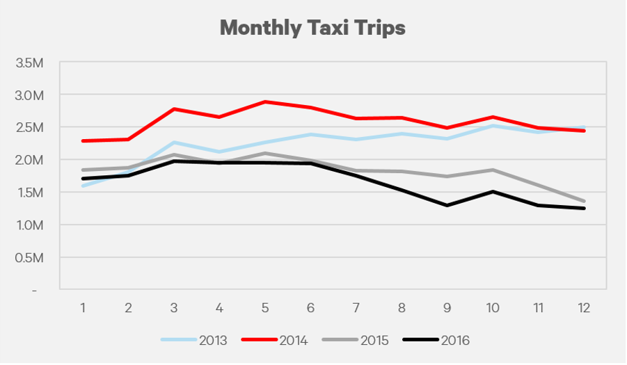
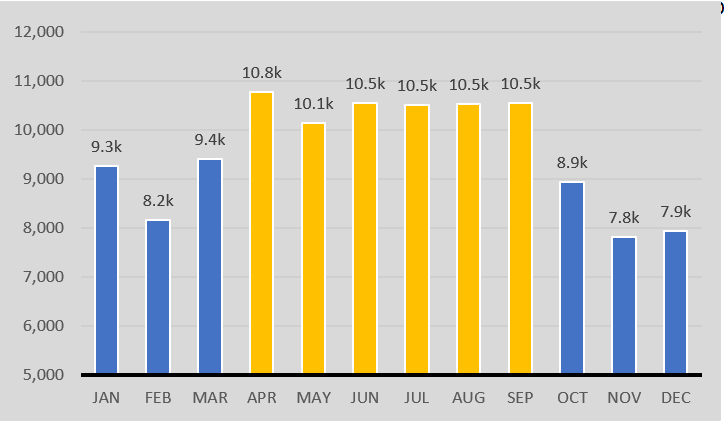
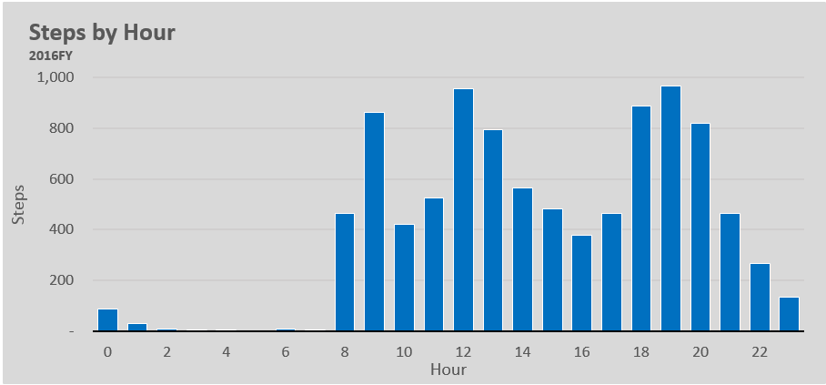
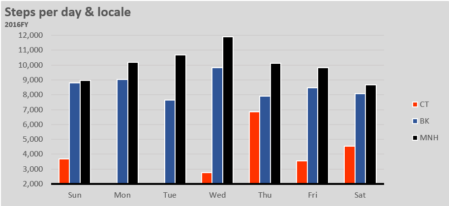
Things changed when I moved into a new apartment in Brooklyn.  This apartment was much closer to a subway, and my steps reflect it.  Keeping all things equal (steps taken on the way to get lunch, running/gym) we can assume that I take 2,000 fewer steps a day.


I took a look at the average amount of steps I took each month.  During the spring/summer months we notice that I took over 10,000 steps!

What hours did I walk the most in 2016?  To no one’s surprise, I walked the most during my weekday commute 9am, 6-8pm.  As mentioned earlier, I walked almost 1 mile to the nearest subway which would account for the 800+ steps I took during those times.


How do you track every step you take?

First you’ll need an iPhone with the Health app installed, which allows your phone to track every step using movement, similar to a pedometer.

Next, you’ll need to download this app: QS Access which will allow you to export a CSV of your daily steps onto Google Drive.

PIVOT TABLE Tutorial for Beginners

Pivot tables are a powerful tool for data analysis in Excel.  Large datasets can be easily digested in a fraction of a second to provide you with more relevant and actionable information.


Imagine a data file with every purchase you made last year. How would you calculate how much you spent at at Starbucks?  What about the average amount? Without pivot tables, you would filter the data, then copy it into another tab, and then use a sum on it.  With a pivot, you could select Starbucks and your total expenses in three clicks.

Step by Step Instructions

  1. Highlight the cells you want to pivotCreate a pivot table in Microsoft Excel
  2. Open the “Insert” tab which is located towards the top of the Excel window
  3. Click the Pivot Table button
  4. When the Pivot Table window pops up, click “ok” to create a pivot table in a new tab

Calculated Fields

Pivot tables have a secret feature that allows you to create an entire new field in the pivot table which can help create ratios using two columns from your data.   In the image below, I’m calculating the average fare of a taxi ride in New York 

City by dividing the Fare (Sum of Fare) and dividing it by the Trips (Sum of Trips).


examples of a calculated field
Digital Advertising Calculated Fields

Click Through Rate = Clicks/Impressions

eCPM = 1000 * Ad Revenue/Impressions


CPC = Ad Revenue/ Clicks

taxi Calculated Fields

Tip % = Tips/Fare

Average Fare = Fare/Trips