Build maps with the US Census data and R

Before you start

Install the main packages: tidycensus, tidyverse, and leaflet. The example below will install the packages if you don’t have them. Get a Census Key here.

library_list <- c("leaflet","stringr","sf","tidyverse","tidycensus","purrr","knitr","scales")
for(library in library_list){
  
  if(!require(library, character.only = TRUE)){
    install.packages(library, dependencies = TRUE)
    require(library, character.only = TRUE )
    
  }

census_api_key(key = "KEY_GOES_HERE", install = TRUE,overwrite = TRUE)
readRenviron("~/.Renviron") 
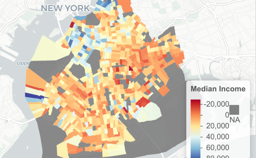
options(tigris_use_cache = TRUE)

Median Income in Brooklyn

Census data consists of the decennial dataset, which you know as the survey Americans fill out every ten years, and the American Community Survey (ACS) which is completed every year. Every section of the United States has a 12 digit code maintained by the US Census.

The taxonomy format: State (2) – County (3)- Tract (6) – Block Group (1). The code 36047016500 would be interpreted as New York (36), Kings County aka Brooklyn (047 ), Tract (016500).

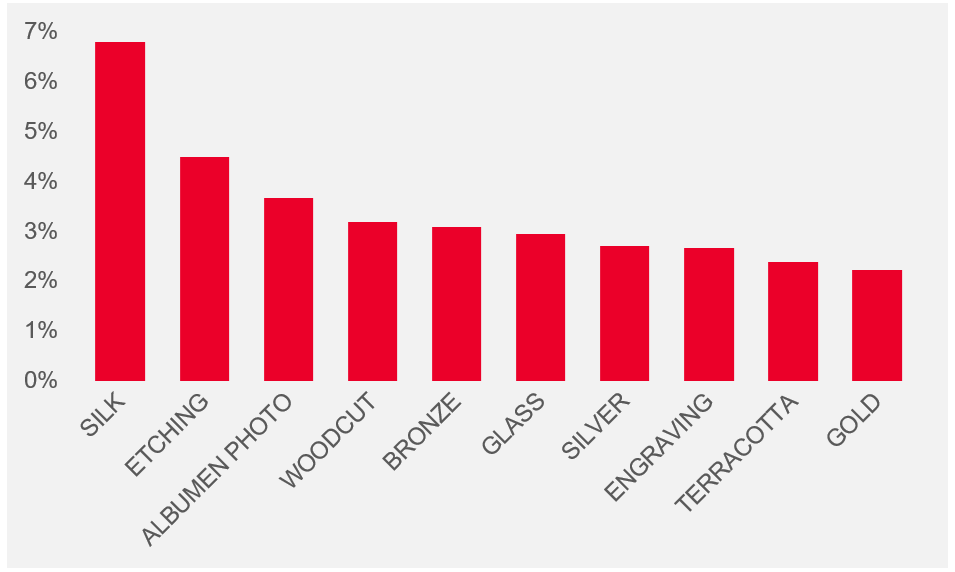
The ACS tracks over twenty-five thousand statistics for things like: income, educational attainment, travel time, age, household size. For this example, use the median income code of B19013_001. The data is available in granularities like State, Country, Tract, which you can see in the get_acs function as “geography”.

To see every variable tracked by the ACS, run this command.

v17 <- load_variables(2019, "acs5", cache = TRUE)
View(v17)

ny_median<-  get_acs(
    geography = "tract"
    , variables = "B19013_001"
    ,state = "NY"
    ,geometry = TRUE
    ,year=2019)

####Important Areas in New York
# 047 Brooklyn
# 081 Queens
# 061 Manhattan
# 005 Bronx

ny_median<-ny_median %>% filter(
   str_detect( GEOID,'36047')
  )

Interactive Map with Leaflet

ny_df<-st_as_sf(ny_median)

pal <- colorNumeric(palette = "RdYlBu",domain = ny_df$estimate)

m<-ny_df %>%
  st_transform(crs = "+init=epsg:4326") %>%
  leaflet(width = "100%") %>%
  addProviderTiles(provider = "CartoDB.Positron") %>%
  addPolygons(popup = ~ str_extract(estimate, "^([^,]*)"),
              stroke = FALSE,
              smoothFactor = 0,
              fillOpacity = 0.9
              ,color = ~ pal(estimate)
              ) %>%
  addLegend("bottomright",
            pal = pal,
            values = ~ estimate,
            title = "Median Income",
            labFormat = labelFormat(prefix = " "),
            opacity = 1
            )
m

I before E except after C is a lie

It’s embarrassing, but I’ve had a lot of trouble spelling the word, “receipt”.  I keep spelling it reciept, which could be avoided if I remembered the simple mnemonic rhyme, “I before E, except after C”.  In this analysis, we see that it’s almost never true.

First, I downloaded a copy of every English word from this github repo, and then running it in Excel, isolated words with the letters “IE” or “EI”.  I found 504 words.

75% of words did not follow the maxim of I before E.


Did the first letter in a word impact the I & E order?  It doesn’t seem so.  Only words beginning with B, J, S and V all had an I before an E.


Length of the word didn’t have a significant impact on the order of the I and the E.   I & E combinations occurred more in words that had a length between 10 and 12 letters.


Williamsburg in seven years

I moved to Williamsburg from the East Village in 2016 because I wanted to pay less rent, shorten my commute and be around a lot of bars and restaurants.  After a year of living Williamsburg, I’ve heard more than my fair share of hipsters gentrifying jokes.  What is interesting about the area is the sense of new-ness in the area.  Looking around, some areas are nothing but apartment building made out of the same metal and glass facade.

Building a time machine with Google

I didn’t live in NYC in 2007, but I am lucky enough to have the next best thing, Google. By using Google Maps’ time machine function.  When in street view, move your cursor to the top left of the screen until you hover over the grey box (in the picture below it says 250 Bedford Ave).  In the bottom part of my box, I can see a clock that labeled, “Street View – August 2007”.  This will open a timeline of every time that Google Street Car has passed by your location.
Note: My goal was to use jQuery to make a before/after effect of the image, but  jQuery and WordPress don’t play well together (it caused my entire site to stop loading), so I published this In a format similar to Business Insider (one big list with next to no insight).

Bedford Avenue

Bedford Avenue is now the heart of Williamsburg, but before that it was full of decaying building.  In the ten years since that photo was taken, an Apple Store, Equinox, Whole Foods and Duane Reade were built in this exact location.


McCarren Park Area

This area would be unrecognizable if it weren’t for the houses on the right hand side of the screen.  In eight years, three huge apartment buildings were built in the empty lots and warehouses of East Williamsburg.


West Williamsburg

No major architectural changes here, but we can see the cities move to make NYC streets more pedestrian friendly.

Central Williamsburg

This was an amazing picutre.  Before most of the major development we could see the Manhattan skyline between the old buildings covered in graffiti.  In the following eight years, there were new building on every block going all the way to the East River.

Conclusion

I wanted this post to go out to show people how much this area changed in a short timespan. What I would love to look at next is the affect on real estate prices, rent and GDP of the area.

5,800 years of data from The Metropolitan Museum of Art

One a cold Tuesday in February, The Metropolitan Museum of Art quietly released data and images on it’s entire collection to the public.  With over 200,000 pieces in it’s collection, The Met is the largest Museum in the Western Hemisphere, and contains relics from 3,800 B.C.

I’m a member of the Met, and try to visit ever 5-6 months.  While I enjoy the experience, one concerning theme that I noticed with this dataset was the lack of data governance.  While it’s understandable that certain pieces would be missing information due to age and lack of record keeping, I found lot’s of objects missing basic data.  In some cases, when the person categorizing the data wasn’t sure, they added a “(?)” after the name.

Country of origin

79% of the pieces in the collection don’t have a country listed

57% don’t have an artist name (not including objects attributed to anonymous)

10% don’t have a classification (ie: Print, Drawings, Ceramic)

The Met has more than paintings

  • 6.8% of pieces are silk
  • 4.5% are etchings
  • 3.7% are Photos

Top Artists at the Met

  • 57% of pieces don’t have an artist listed
  • 2,908 pieces from Allen & Ginter (mostly cards from a tobacco company)
  • 314 Rembrandt
  • 24 Van Gogh
  • 23 Pollock
  • 16 Michelangelo

Conclusion

When I heard that the Met had released it’s data to the public I was excited because I though this was an opportunity to find interesting facts and trends on the different pieces.  What I found was missing datapoints, and inconsistent data that made the dataset difficult to navigate.  I think my next option is to throw this into Python and clean up the data.  I’ll continue to look into the data more and hopefully will have a better post in the future.

Data Sources:

The Metropolitan Museum of Art via Google Bigquery 

Microsoft Excel for visualization

Become a Met Member

Analyzing 99 Million Taxi Trips Using Chicago Open Data

The City of Chicago released a dataset containing 100M trips over four years and it’s a huge win for the Open Data community. In this post, we examine the dataset which tells us everything about a passenger’s journey through Chicago, and see dive into the data to see how the industry is beginning to decline as competition from “Ride Shares”, begin to enter the market.

What’s does the average Chicagoan Tip their taxi driver?

Typically, 21% and that’s been stable since 2013.  Riders do seem to be more generous in December, with 2015 and 2016 having an average of 22% or higher.

Average Monthly Tip % from 2013-2016
What do people normally tip?

In statistics, a dataset has a “normal distribution” when the mean = median = mode,  in normal terms that means the average = middle number in a dataset = number appearing the most.  From the graph above, we see that it doesn’t have the smoothness of a bell curve, but instead, has sharp spikes around the values of 0%, 20%, 25% and 30%.

From my experience with New York Yellow Taxi Cabs, I assume that the payment system presents passengers with a predefined tip amount when paying.  Based on my analysis, 39% of all passengers use a predefined amount, with non-tippers making up 7% of all rides, and tippers (using the 20/25/30 amount) making up 32% of rides.

Note: Tip amounts in the dataset were only available for passengers who used a credit card.

 How are passengers paying for their ride?

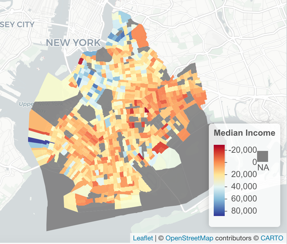
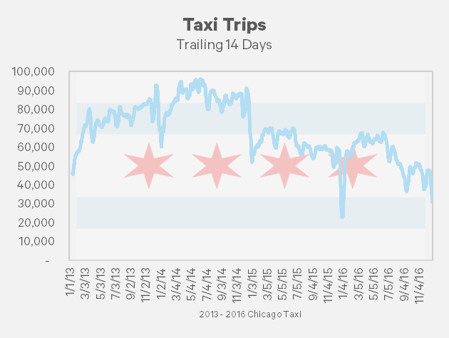
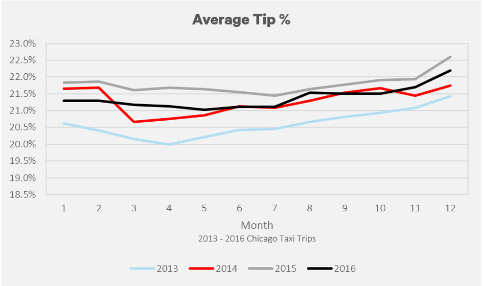
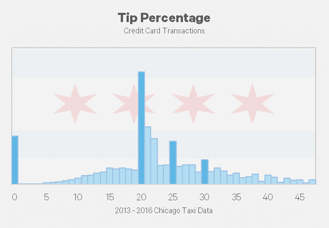
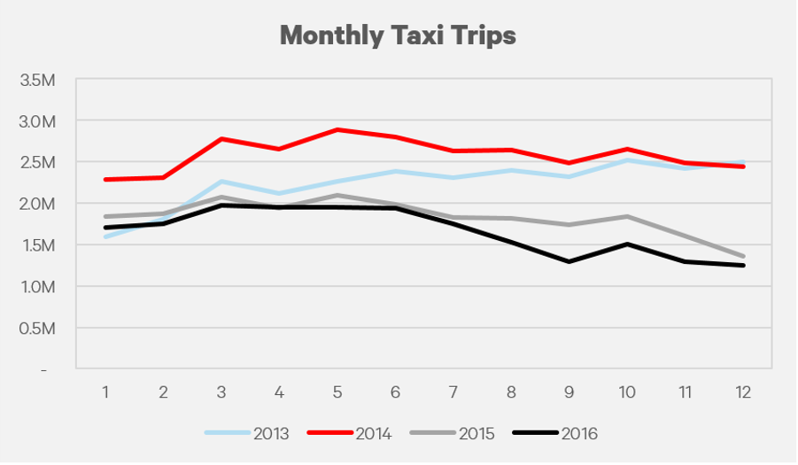
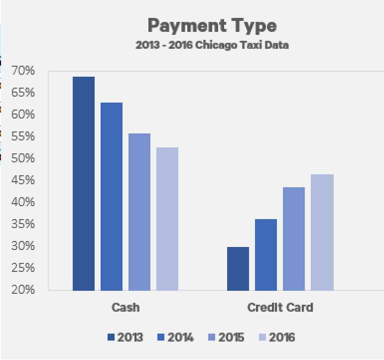
There has been a steady increase in the amount of taxi rides that use a credit card.  From January 2013 to December 2016, the amount of trips using a credit card has increased from 30% to 47%.

Fewer people are using taxis.

2016 was the worst year for the Chicago Taxi industry with only 19.8M rides, the lowest in four years, and 26% lower than 2013.  Interestingly this didn’t have a huge effect on total fares, while trips were down 26%, fares are dropped 18%.  Similarly, while trips are down 10% from 2015, fares have only dipped 1%.

Putting on my economics hat to investigate this decrease, one possible reason for the decrease could be that riders are substituting taxis for ride sharing apps like Uber or Lyft which provide the same service at an equal or lower price.  Or perhaps it’s the January 2016 fare increase of 15%, that has driven consumers away.  In fairness, a 15% increase in Price and a 10% decrease in Quantity would suggest that the demand is slightly inelastic, but I digress. Other less likely reasons could be changes in public transportation, bikeshare programs, or more walking.

How fast does a taxi travel?

How long does a passenger spend in a taxi?

I found an interesting trend in average trip duration which seems to follow a seasonal trend. The winter months tend to have a shorter trip duration.  With a brutal winter, many passengers likely opt to take a taxi for shorter distances than they would in summer months.

Average time a taxi was in service

Average Monthly Fare

Similar to the average trip duration, the average fare follows a similar trend.  Winter months have a lower overall fare than the summer months.  January seems to be consistently 10% lower than May for each year in the dataset.


Conclusion

The Chicago Taxi business is in decline and has seen +10% decreases for two consecutive years.  The introduction of competition from ride share apps like Uber and Lyft has surely eaten into their business and will continue to increase market share as their businesses expand.  From a data perspective we found interesting stats on tip percentage, speed, and ride duration while also witnessing the affects of weather on how the city commutes.  This was an interesting dataset, and I want to look closer into the effects of how neighborhoods pickup/ dropoffs, but first I have to learn about Chicago neighborhoods (or do they have buroughs like NYC?).  My next steps will be to compare NYC to Chicago to see how each city’s taxi compares to the others.

Sources:

Big thanks to the City of Chicago (and more specifically Freedom of Information Laws) which released taxi ridership data into the public domain, and another bigger thanks to Google for adding this into the Big Query dataset and allowing users access to query the information and use it for free.  Chicago, NYC and several other datasets can be found in their database.

Data Sources: Taxi Data via Google Big Query

Code and queries: I need to set up a Github link with code used to generate these queries.

Visualizations Sources: Graphs created using Microsoft Excel.

There are 10,665 people in America named Shaq

During Super Bowl XLI, you may have seen a commercial about “Super Bowl Babies“,  which are babies conceived immediately following a city’s Super Bowl win.  While I believe the link between conception and championship is difficult to prove, it doesn’t mean that sports can impact a parent’s decision making.  This commercial did remind me of a Clemson football player named Shaq Lawson, which makes him the second person named Shaq I had ever heard of.

Using the Social Security Administrations data, and Google Big Query, I decided to look at the names of Hall of Fame players with unique names, and look at the number of babies born during that time with their name.  I chose five athletes, Shaquille O’Neal, Michael Jordan, Tiger Woods, Kobe Bryant, and Lebron James.


When did each name peak?


Shaq (’92, ’93, ’94)

Before 1973, Shaq (and Shaquille) did show up in the SSA’s published data, but twenty years later peaked at 2,422.

The most popular years for the name Shaq began after Shaquille O’Neal was drafted out of LSU with the first draft pick in the 1992 NBA Draft.  During his first three years with the Orlando Magic he won Rookie of the Year, appeared on the cover of Sports Illustrated, and finished fourth in MVP voting.  ESPN listed Shaq as the fourth best center of NBA history.

Kobe (’00, ’01, ’02, ’03)

The first name Kobe went from 307 in 1996, to 1,093 in 1998 which coincided with Bryant’s second season with the Lakers.  From ’01 – ’03 Bryant finished in the top ten in MVP voting each year, and won three NBA championships during that time.


Jordan (’90, ’91, ’97, ’98)

Jordan was next, there were 660 people named Jordan in 1977, but 22,080 in 1990, and was by far the most popular of the five names analyzed.

The top years for the name Jordan coincided with Michael Jordan’s peak with the Chicago Bulls.  During his tenure, Jordan won six NBA championships and Finals MVPs, and 5 All-Star awards.  Jordan is considered to be the best player in NBA history.


Tiger (’97, ’98, ’10)

Tiger won’t go down as the most popular name, but it is a unique first name that first appeared in 1997 after Tiger Woods won the 1997 Masters Tournament.  Interestingly enough, the most popular year for the name Tiger was 2010 when Tiger was the center of an infidelity scandal.

Lebron (’07, ’10)

I was surprised to see the Lebron hasn’t been a popular name despite James’s championship wins with the Heat, major endorsement deals with Nike.  Only two years have had more than 50 people named Lebron born: 2007 and 2010.