Williamsburg in seven years

I moved to Williamsburg from the East Village in 2016 because I wanted to pay less rent, shorten my commute and be around a lot of bars and restaurants.  After a year of living Williamsburg, I’ve heard more than my fair share of hipsters gentrifying jokes.  What is interesting about the area is the sense of new-ness in the area.  Looking around, some areas are nothing but apartment building made out of the same metal and glass facade.

Building a time machine with Google

I didn’t live in NYC in 2007, but I am lucky enough to have the next best thing, Google. By using Google Maps’ time machine function.  When in street view, move your cursor to the top left of the screen until you hover over the grey box (in the picture below it says 250 Bedford Ave).  In the bottom part of my box, I can see a clock that labeled, “Street View – August 2007”.  This will open a timeline of every time that Google Street Car has passed by your location.
Note: My goal was to use jQuery to make a before/after effect of the image, but  jQuery and WordPress don’t play well together (it caused my entire site to stop loading), so I published this In a format similar to Business Insider (one big list with next to no insight).

Bedford Avenue

Bedford Avenue is now the heart of Williamsburg, but before that it was full of decaying building.  In the ten years since that photo was taken, an Apple Store, Equinox, Whole Foods and Duane Reade were built in this exact location.


McCarren Park Area

This area would be unrecognizable if it weren’t for the houses on the right hand side of the screen.  In eight years, three huge apartment buildings were built in the empty lots and warehouses of East Williamsburg.


West Williamsburg

No major architectural changes here, but we can see the cities move to make NYC streets more pedestrian friendly.

Central Williamsburg

This was an amazing picutre.  Before most of the major development we could see the Manhattan skyline between the old buildings covered in graffiti.  In the following eight years, there were new building on every block going all the way to the East River.

Conclusion

I wanted this post to go out to show people how much this area changed in a short timespan. What I would love to look at next is the affect on real estate prices, rent and GDP of the area.

5,800 years of data from The Metropolitan Museum of Art

One a cold Tuesday in February, The Metropolitan Museum of Art quietly released data and images on it’s entire collection to the public.  With over 200,000 pieces in it’s collection, The Met is the largest Museum in the Western Hemisphere, and contains relics from 3,800 B.C.

I’m a member of the Met, and try to visit ever 5-6 months.  While I enjoy the experience, one concerning theme that I noticed with this dataset was the lack of data governance.  While it’s understandable that certain pieces would be missing information due to age and lack of record keeping, I found lot’s of objects missing basic data.  In some cases, when the person categorizing the data wasn’t sure, they added a “(?)” after the name.

Country of origin

79% of the pieces in the collection don’t have a country listed

57% don’t have an artist name (not including objects attributed to anonymous)

10% don’t have a classification (ie: Print, Drawings, Ceramic)

The Met has more than paintings

  • 6.8% of pieces are silk
  • 4.5% are etchings
  • 3.7% are Photos

Top Artists at the Met

  • 57% of pieces don’t have an artist listed
  • 2,908 pieces from Allen & Ginter (mostly cards from a tobacco company)
  • 314 Rembrandt
  • 24 Van Gogh
  • 23 Pollock
  • 16 Michelangelo

Conclusion

When I heard that the Met had released it’s data to the public I was excited because I though this was an opportunity to find interesting facts and trends on the different pieces.  What I found was missing datapoints, and inconsistent data that made the dataset difficult to navigate.  I think my next option is to throw this into Python and clean up the data.  I’ll continue to look into the data more and hopefully will have a better post in the future.

Data Sources:

The Metropolitan Museum of Art via Google Bigquery 

Microsoft Excel for visualization

Become a Met Member

I recorded every step I took for over two years

I used my iPhone to record every step I took from November 2014 to December 2016.  I found some interesting trends after looking at average daily temperature, day of week, and location.

Some like it hot

After downloading the data from my phone, I compared my steps to the daily average temperature (source: NOAA) to see how temperature affected my activity.  On ‘hot’ days (temperature higher than 83 degrees), I averaged more than 11k steps.  This is because I like to take advantage of the warm weather and run 3 – 6 miles along the East River park on weekends, and squeeze in a couple of 2 – 4 mile runs on weekdays.  What’s interesting is that there seems to be a baseline step amount of 8,700 steps, meaning, that no matter the temperature, I always needed to walk 8.8k steps.  I cover this later, but this was likely because of my apartment’s distance from the subway.

The graph below is is probably my favorite representation of temperature and frequency.  I found this graph type when I was looking at a DC Bike Share on Kaggle.com.  On the x-axis is the temperature, the y-axis is my steps, the colors represent the type of weather (cold vs hot) and each marker repersents a day over the last 2+ years.  Like the previous image, you can see a slight increase in daily steps as the temperature rises.

NYC Real Estate

From 2014-2016 I lived in three different places, Connecticut, Manhattan, and Brooklyn.  My most active days were when I lived in the East Village, where the closest subway was almost a mile from my apartment.  Just getting from my apartment to work, meant that I walked almost two miles roundtrip. Things changed when I moved into a new apartment in Brooklyn.  This apartment was much closer to a subway, and my steps reflect it.  Keeping all things equal (steps taken on the way to get lunch, running/gym) we can assume that I take 2,000 fewer steps a day.


I took a look at the average amount of steps I took each month.  During the spring/summer months we notice that I took over 10,000 steps!

What hours did I walk the most in 2016?  To no one’s surprise, I walked the most during my weekday commute 9am, 6-8pm.  As mentioned earlier, I walked almost 1 mile to the nearest subway which would account for the 800+ steps I took during those times.


How do you track every step you take?

First you’ll need an iPhone with the Health app installed, which allows your phone to track every step using movement, similar to a pedometer.

Next, you’ll need to download this app: QS Access which will allow you to export a CSV of your daily steps onto Google Drive.

How to run 300 miles

In January 2016, I set a goal for myself that I would run 300 miles in 2016.  This would be a 50 mile increase from 2015 – a year where I ran more than any year previous –  and an 80 mile increase from 2014.  The rules were simple, only running counted toward 300, of the miles run, they had to be recorded in the app, MapMyRun, warmups and cool-downs don’t count towards the mileage, and treadmill running doesn’t count unless it’s over 1.5 miles.

Setting Quarterly Goals

I knew from the start that it’s unlikely that I’ll run the same every week – temperature, daylight, and likelihood of injury all factor into my running decisions.  With this in mind, I set the following quarterly mile goals:  50, 75, 125, and 50 miles.  My rationale was simple, I have less of an opportunity to run in Q1 & Q4 because of weather and an early sunset.  Injury is a major concern too, if I go out to fast in Q1, I could injure myself and be out for a month.

My July – September goals were justified because of the same reasons as my Q1 goal.  From May to August, the sun sets after 7:30p, which allows me enough time to leave work and run 3+ miles.  This takes the burden off of weekends, which means that I’m not dependent on 2 out of 7 days for my ten mile weekly goal.  Also, longer days mean I don’t need use the gym treadmills where I run 2.5 miles before getting too bored to finish.

Reality vs Goals

Part of this post is to be honest with myself.  Even though I modeled this down to the week, I still fell well short of my goal.  To avoid failing again, we need to learn from my mistakes.

We can see that my actual running in Q1 fell short of what I thought was possible.  This is the result of several factors: weather and work.  Jan and Feb were pretty brutal, there was a “blizzard” the first week of February which prevented my from running most of Feb.

Q3 was the biggest reason I missed my goal.  In January I set a personal goal of 125 miles over a 13 week span.  In theory this was easy to achieve, I would need to run 10 miles a week, or run 3.33 miles three times a week (probably Wednesday, Saturday and another date).  In reality I wasn’t able to meet this goal, for reasons I’m still trying to understand.  Part of it may be related to my personal life, I went on more dates on weekdays and weekends.  Another reason may be the 3 mile races I competed in every Wednesday.  These races were tough, and I felt like I had to rest for several days to recover from the races.

Next Steps

Since I didn’t run 300 miles last year I’ve decided to fulfill this goal in 2017.  I’ll need to learn from the mistakes of 2016, and be more proactive in Q3 when the goal is higher.  I’ll also need to determine if I’ll accomplish this with a lot of short runs (1.5 – 3 miles), or longer runs 4 miles.  I’ve entertained the idea of training for a half-marathon to accomplish this with less runs, but I prefer to keep my training (and racees) under 6 miles per run.

NYC Crime Data Analysis of 2015

One of my goals over the next year is to analyze more of the data freely available from New York City public agencies like the NYPD, 311, TLC, and MTA.

Today, I decided to analyze the NYPD’s dataset, the Seven Major Felonies for 2015 (or technically the first nine months of 2015).  I’m a big fan of the COMPSTAT releases available on the NYPD’s website, which break out crime into several categories, timeframes, locations, and shooting incidents and a comparison at the bottom of each PDF, comparing the current year against previous years (2016, 2001, 1998, 1993, 1990).  Today’s dataset is going to focus on the NYPD’s ‘seven major felonies: rape, murder, burglary, robbery, grand larceny, felony assault, and grand larceny of a motor vehicle.


The data can be found here.

Interesting Findings

Felony assaults are twice as likely to occur between midnight and 4am on Saturday and Sunday.

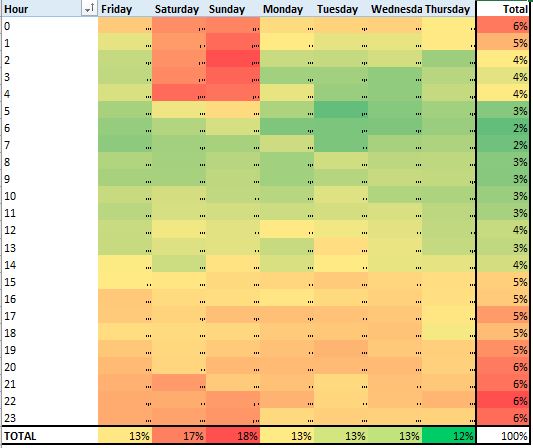
Staten Island has zero murders on Wednesday or Friday.

Bronx murders peak at 3pm, and 8pm, and 1am

Summer between midnight and 4am is when most robberies occur

8% of grand larcenies occur at noon
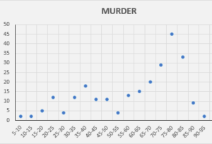
 

Murder (257)

This is category I find interesting because of the drop over the last 25 years.  In 1990, NYC once average a over 6 murders per day, and ended 1990 with 2,245, this number has plummeted to (only) 352 in 2015.  It’s difficult to say what caused this drop from a dataset perspective, but we are able to see trends in the 2015 data by layering on time, temperature and location.

One of my favorite quotes regarding the correlation between the murder rate and temperature came from former Queens resident 50 Cent.  On his album ‘Get Rich or Die Tryin’, he postulated, “They say summer time is the killing season, it’s hot out in this bitch, that’s a good enough reason“.  Fifty does seem to have a point, looking at the average number of murders that occur at a certain temperature, 75-80 degrees (Fahrenheit) is when murders peak at 45.

It’s difficult to say what causes the spike using only data, but we can make some guesses.  One guess is that people may be more likely with to go outside when there’s more daylight and warmer weather.  This could lead to more confrontations with friends/enemies/strangers.  Another guess would be the summer vacation schedule causes more teenagers to get into trouble, an ”.

BURGLARY (10,945)

The distribution of burglary seems to be dependent on time of day.  From 2pm-4am, each hour of the day will account for 5% of reported burglaries, but between 5am and 1pm, that number falls between 2-3%.  I don’t have information on the location of the burglary ie: Residential vs commercial, which would be useful to know who is affected, and if the location affects the reporting.  My guess is that it’s hard to determine whether these burglaries occurred at the time in the dataset, or if it’s when the NYPD received them.


RAPE (1,080)

This felony seems to be concentrated within several days and hours with several noticable spikes.  13% of rapes occur at midnight, in terms of weekday, Saturday and Sunday make up 18 and 17% respectively.  There are small spikes in the data at 4am, 8am, and noon.

Grand Larceny of a Motor Vehicle (5,515)

I’ve only briefly looked at this felony, but it appears that half occur between 6pm and midnight.  Breaking it out by month, 27% of GL’s were commited in August and September, while only 17% occured in January and February.
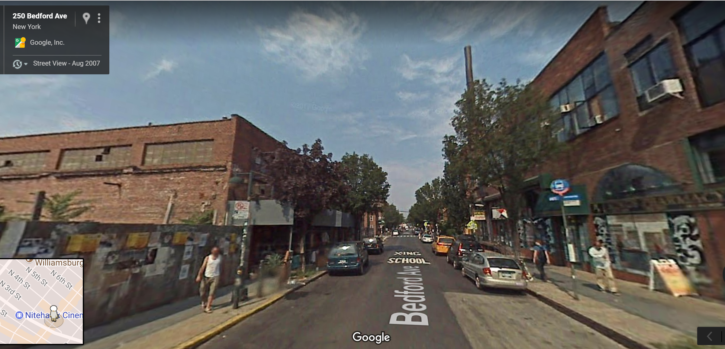
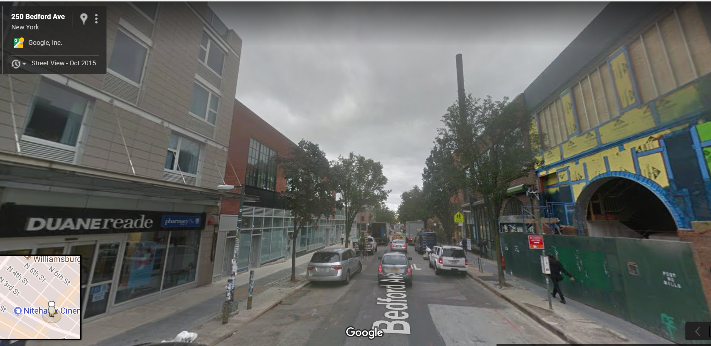
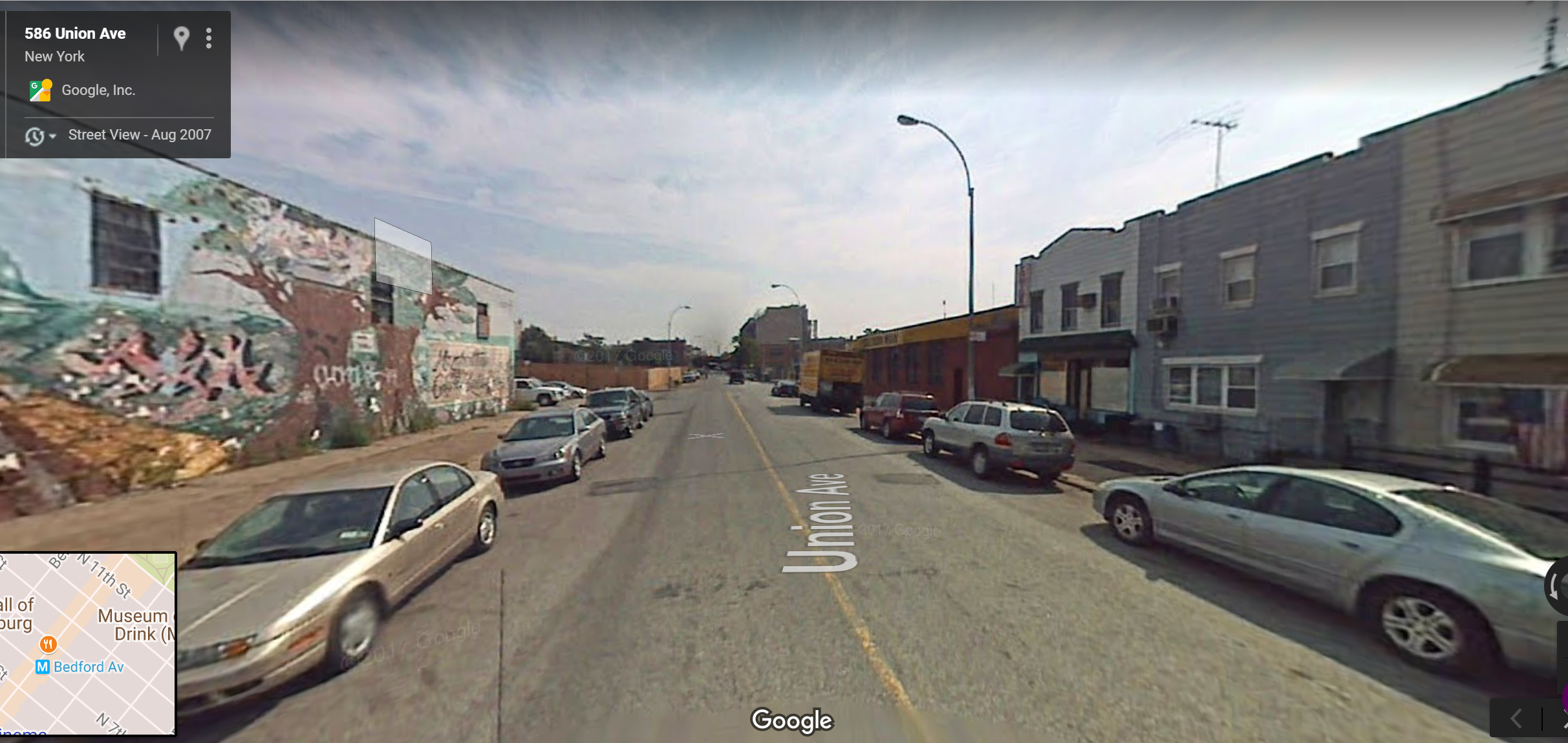
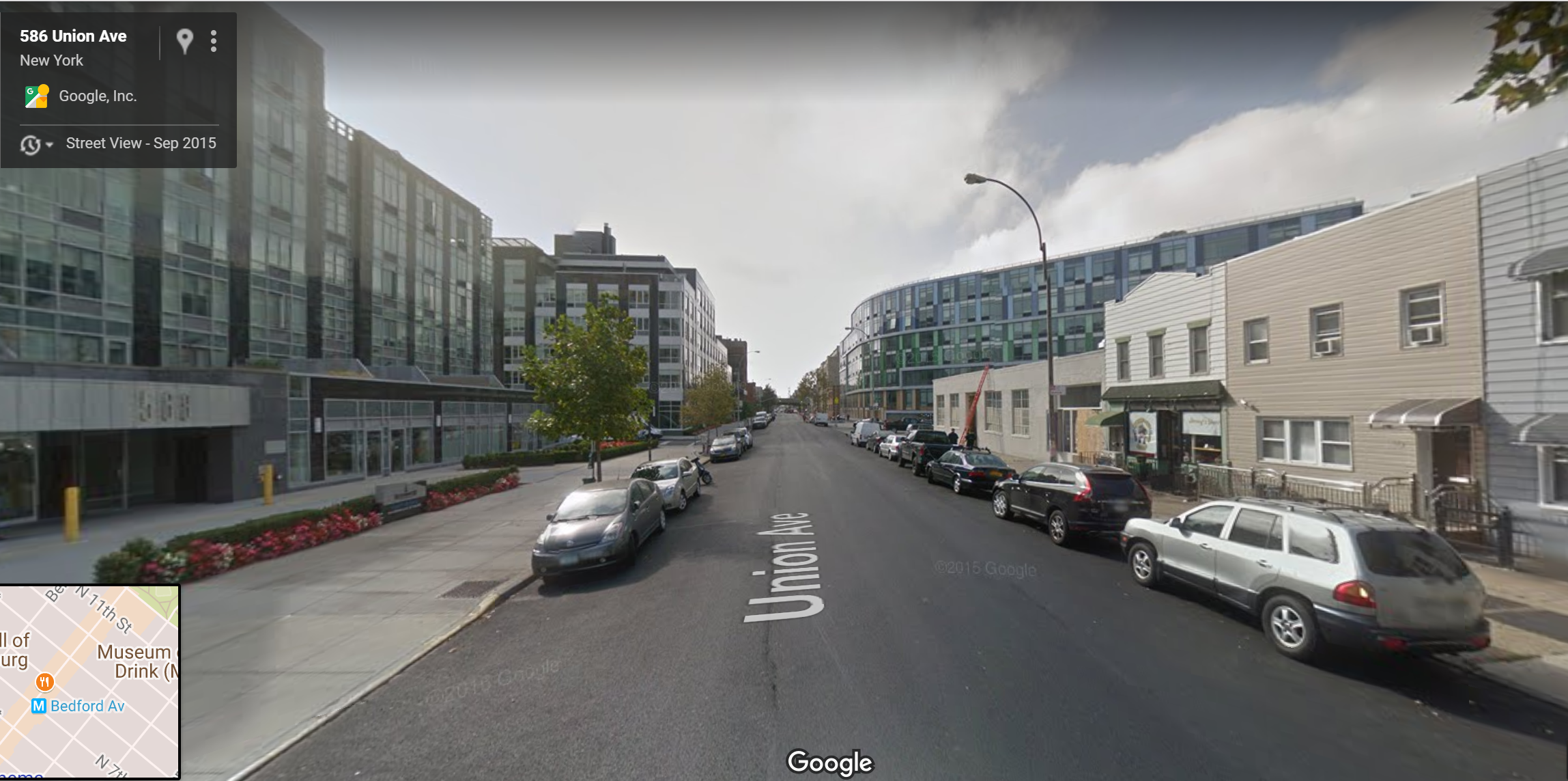
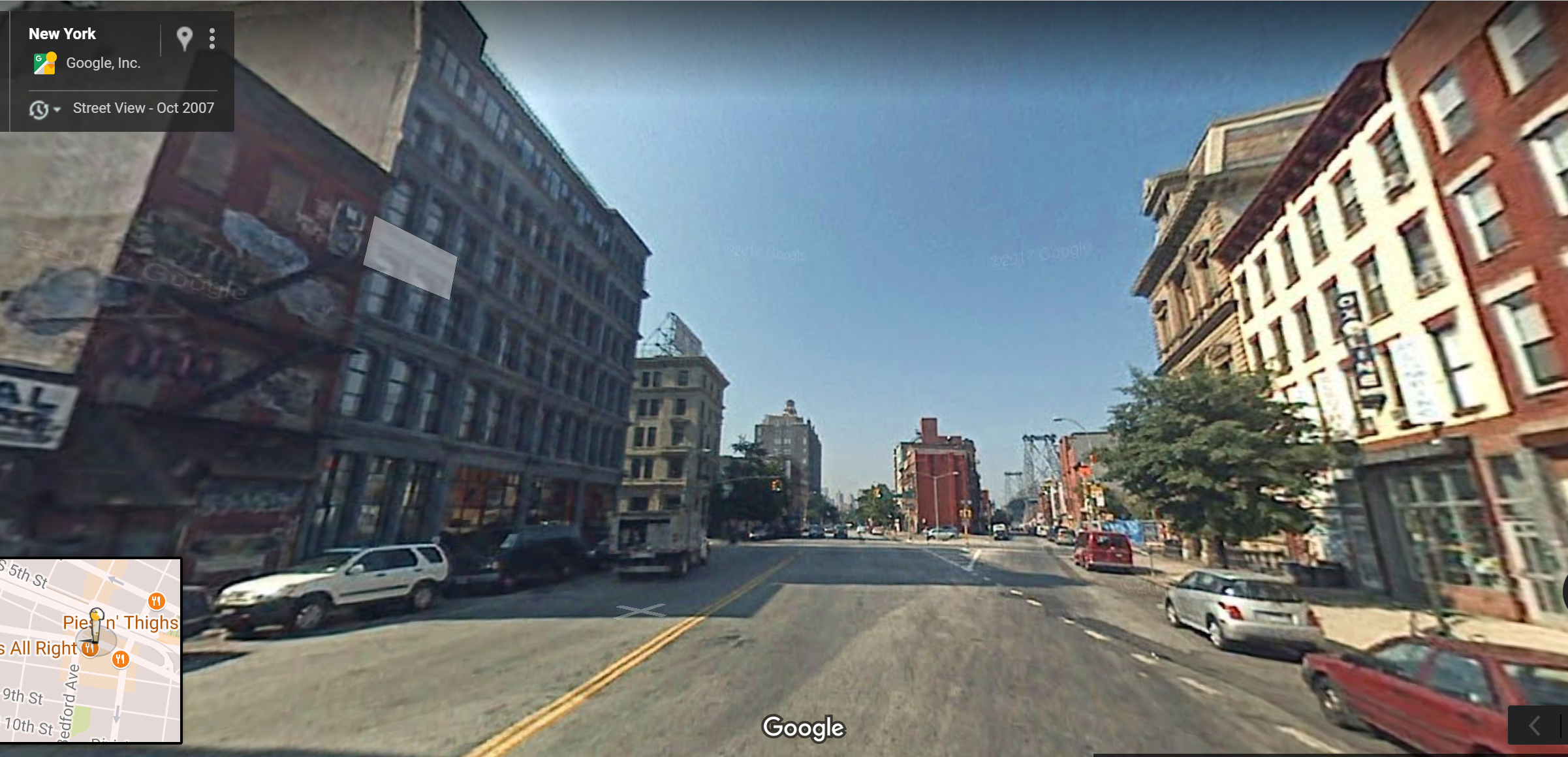
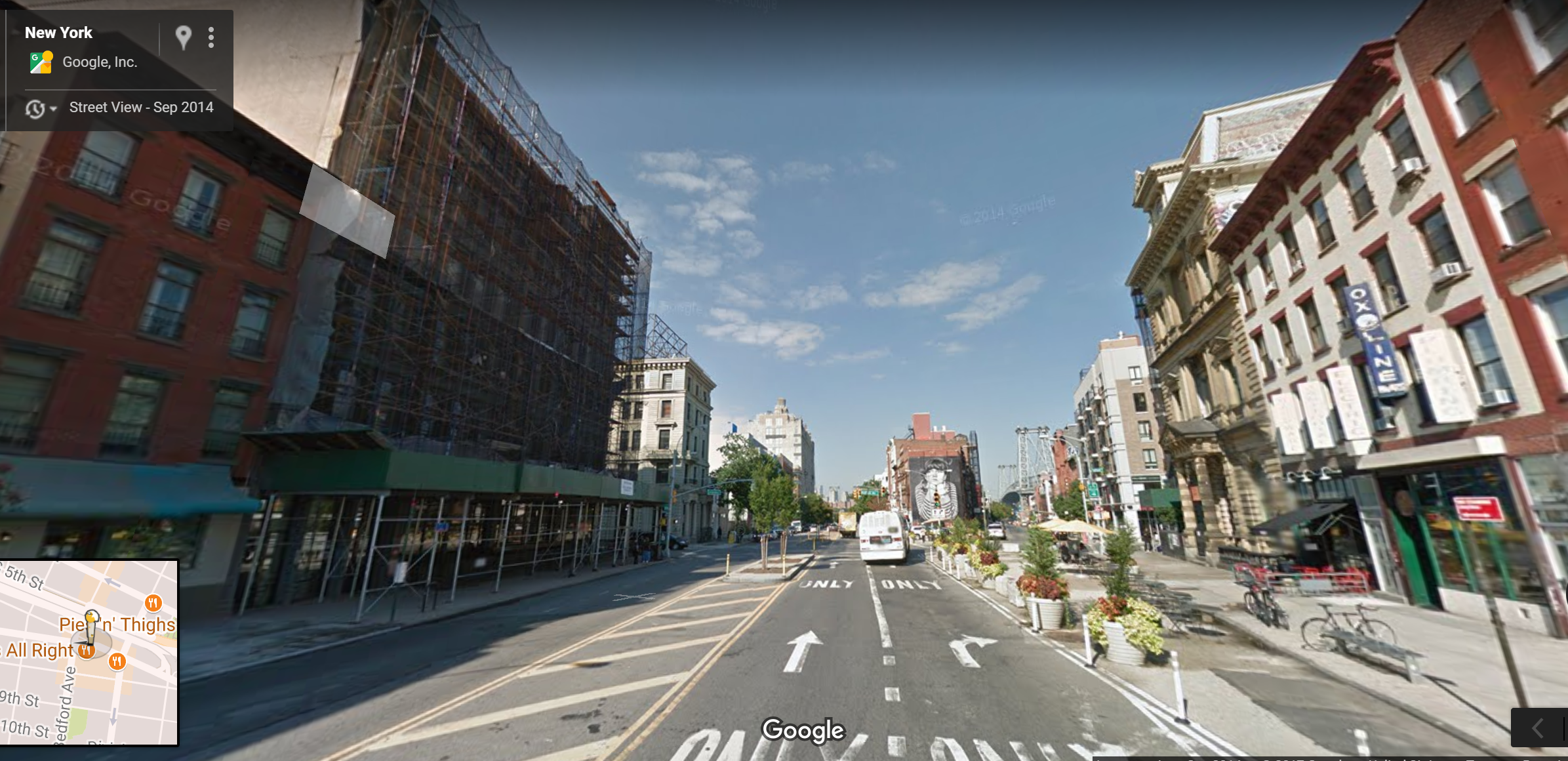
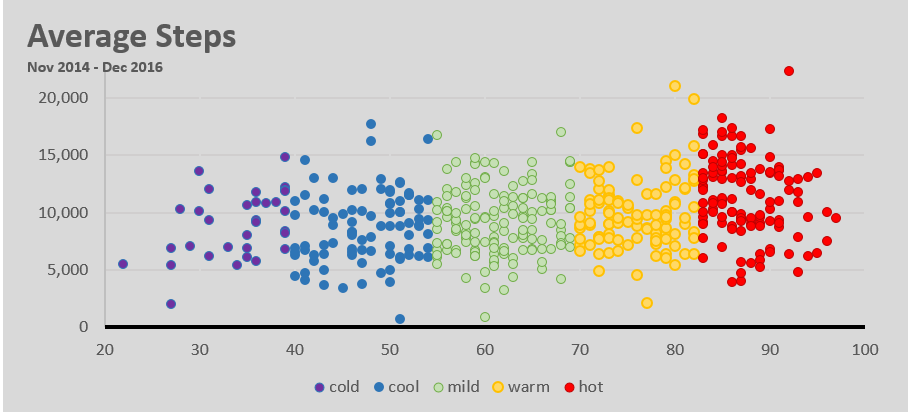
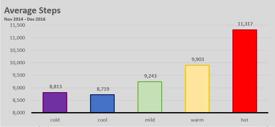
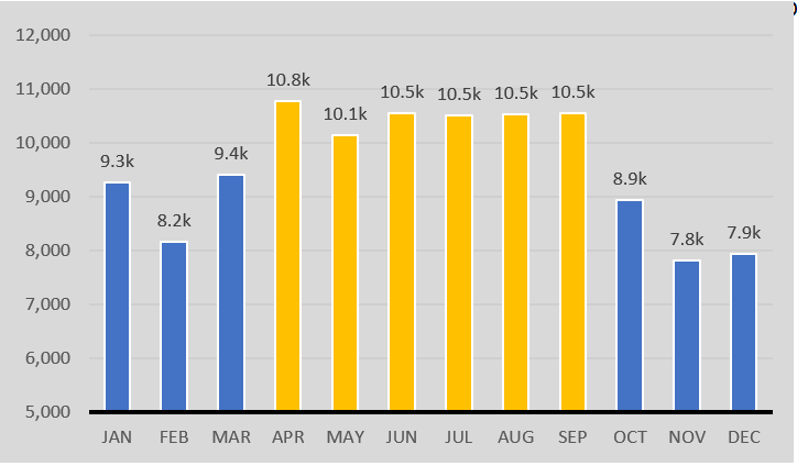
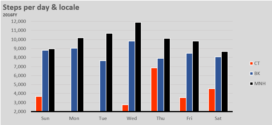


NYC Taxi Data 2015

The New York City department of Taxi and Limousines released data for every $2.5 billion and 187 million trips in 2015.  This dataset contains pickup time, location and dropoff coordinates, fare, tip amount and transaction type for 2015.


Interesting findings:

New Yorkers Aren’t Morning People

It’s pretty nice being a taxi driver these days.  On average, taxi drivers who were tipped, received an average tip of 20.0% (credit card transactions only).  The best tips occur between 4 – 5pm, that’s when drivers receive tips 5% higher than the 20.0% average.  Apparently, New Yorkers aren’t morning people, the worst time to drive a taxi is 7 – 8am, that’s when drivers recieve the lowest tips 4% lower than average.

Hourly Taxi Tips

54% of trips used a credit card

Since this analysis only looks at credit card trips, we see grouping around the pre-selected tip amounts in the creditcard reader of 15%, 20% and 25%.  It seems that 20% is the most selected tip amount: 42% of tips were between 19 – 22%.

Tip Histogram

Source:

NYC Taxi Data | Google Big Query

Microsoft Excel (Graphs)