Picking the best python graphs for beginners – Plotly, Seaborn, Matplotlib, Chartify

Are you new to Python and trying to make a beautiful graph? I’ve reviewed four of the most popular and picked the best option for beginners.  For the cells below, I used Jupyer Notebook with these modules that can be installed via pip (pandas, numpy, plotly, cufflinks, seaborn, chartify).

In a normal day, I’ll open my Jupyter Notebook, import a CSV that I created using SQL/Hive.

remember, this doesn't go in jupyter notebook, it goes in your terminal (the thing with a black screen, sort of looks like that thing from The Matrix)

pip install plotly
pip install cufflinks
pip install chartify
pip install seaborn
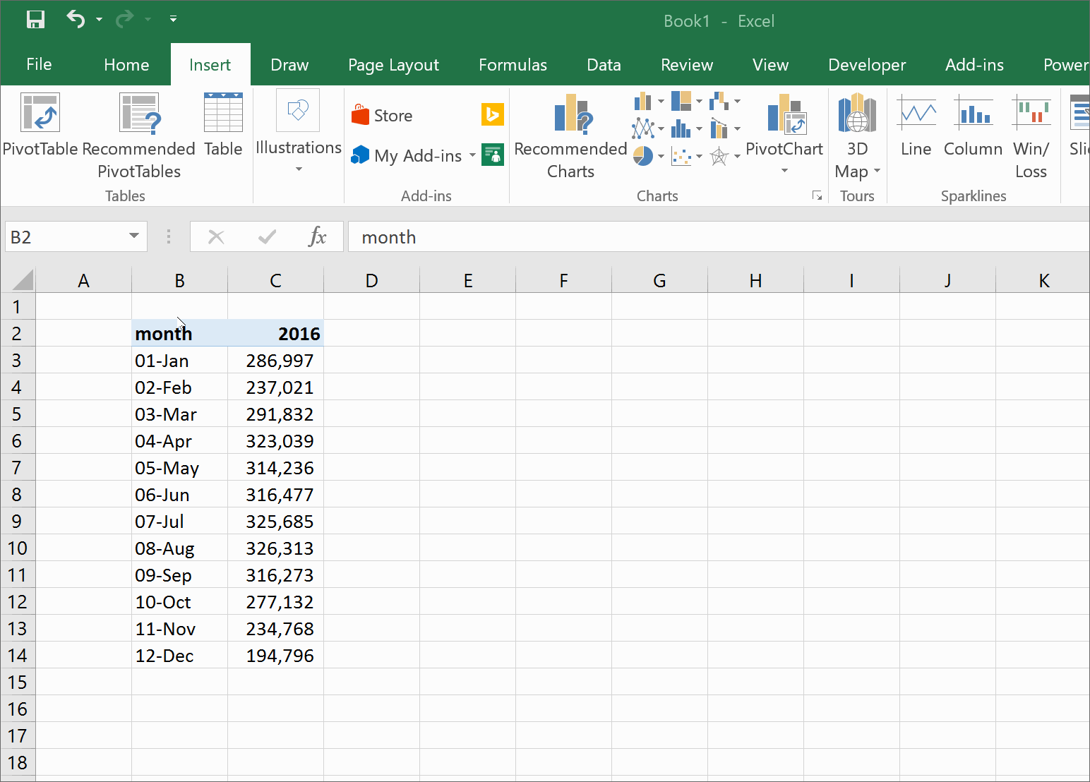
import pandas as pd
import numpy as np

%matplotlib inline

import pandas as pd


%cd -q Downloads 
#%cd this changes my directory to the Downloads folder

df1=pd.read_csv('blog_example.csv')
#this uses pandas (pd) to read the csv in the Downloads folder
#this example data mimics Google Ad Manager data, but for this exercise, it's full of random numbers

df2=df1.pivot_table(values='imps',index='day',columns='subset',aggfunc='sum')
#I now have two dataframes: df1, df2. This will be used later, depending on the graph

df2.head()
#.head() will show the first five rows of df2 

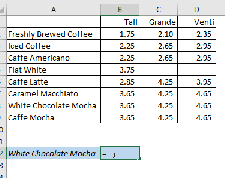
Download example data here.

Plot.ly

Link

Learning Curve: Low, my pick for best graphing module for beginners.

What I like: Interactive, easiest library to use for beginners, pretty themes out of the box, other features (export, save as png), easy to understand documentation for new users.


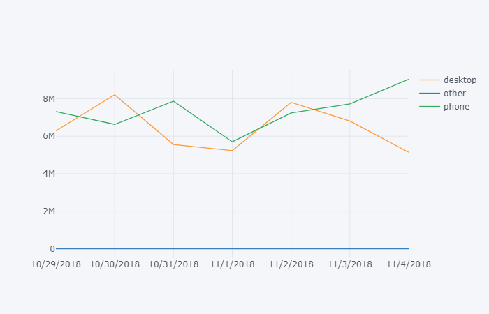
What I don’t like: version 2.x is slow.  If you don’t use cufflinks, this becomes one of the most difficult graphing libraries. Requires additional code to run in offline mode.


import plotly
import cufflinks as cf

cf.go_offline() 
#cf.go_offline() allows you to use plotly in jupyter

df2.iplot()

Chartify

Link

What I like: Easy to write, built by Spotify Data Science team.

What I don’t like: Requires an additional exe to run (from Google).


import chartify
df=df1.groupby(['day','subset'],as_index=False).sum() 
#chartify can handle a flat table, no need to pivot it

%cd -q
#%cd was needed to change the active directory to 'python', earlier in this lesson I moved it to the Downloads folder. 

ch = chartify.Chart(blank_labels=True, x_axis_type='datetime')

ch.plot.line(
    data_frame=df,
    x_column='day'
    ,y_column='imps'
    ,color_column='subset'
)
ch.show()

Seaborn

Link

pip install seaborn
sns.set()
#sns.set is optional, but I like the formatting
sns.lineplot(x='day',y='imps',hue='subset' ,data=df1,ci=None);

What I like: Pretty visualizations out of the box, great at heatmaps.

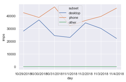
What I don’t like: I’ve personally had trouble writing

and remembering the formatting of the plotting functions.

Matplotlib

Link

pip install matplotlib

df1.plot()

Learning Curve:

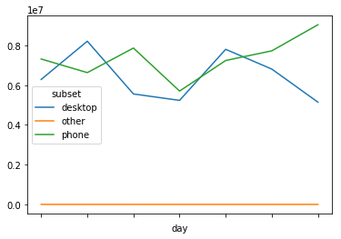
What I like: Customizable, lots of documentation on StackOverflow

What I don’t like: Difficult to remember all the features.  Learning curve is prohibitive to new users.

PIVOT TABLE Tutorial for Beginners

Pivot tables are a powerful tool for data analysis in Excel.  Large datasets can be easily digested in a fraction of a second to provide you with more relevant and actionable information.


Imagine a data file with every purchase you made last year. How would you calculate how much you spent at at Starbucks?  What about the average amount? Without pivot tables, you would filter the data, then copy it into another tab, and then use a sum on it.  With a pivot, you could select Starbucks and your total expenses in three clicks.

Step by Step Instructions

  1. Highlight the cells you want to pivotCreate a pivot table in Microsoft Excel
  2. Open the “Insert” tab which is located towards the top of the Excel window
  3. Click the Pivot Table button
  4. When the Pivot Table window pops up, click “ok” to create a pivot table in a new tab

Calculated Fields

Pivot tables have a secret feature that allows you to create an entire new field in the pivot table which can help create ratios using two columns from your data.   In the image below, I’m calculating the average fare of a taxi ride in New York 

City by dividing the Fare (Sum of Fare) and dividing it by the Trips (Sum of Trips).


examples of a calculated field
Digital Advertising Calculated Fields

Click Through Rate = Clicks/Impressions

eCPM = 1000 * Ad Revenue/Impressions


CPC = Ad Revenue/ Clicks

taxi Calculated Fields

Tip % = Tips/Fare

Average Fare = Fare/Trips


VLOOKUP Tutorial and 3 Easy Tips

VLOOKUP and how you should it

Summary

The vlookup Excel formula searches your data for a keyword and returns a value instantly.  Think of how you order at Starbucks: If I want to know how much an Iced 

Coffee costs, I would find the Iced Coffee on the menu (2nd from the top), and


look to the right to see that a small costs $2.25.  Excel does the same thing, except it can search 100,000 items, in the same amount of time it takes you to search through 10.

Real Life Examples

Lets keep using the Starbucks menu for this example.  We want to know how much a White Chocolate Mocha would cost if we purchased the Grande size.  In this example, the “lookup_value” is in cell A12 ‘White Chocolate Mocha’, the “table_array” is A2:D9, the “col_index_num” is 3 and “[Range lookup]” is false. What vlookup is doing, is searching for ‘White Chocolate Mocha’ in the table we highlighted in red, and looking at the third column.  If we wanted the price of a Venti, we would have used 4 instead of 3 as the “col_index_num”.

IMPORTANT NOTE:  “lookup_value” aka White Chocolate Mocha always needs to be in the first column in the table.

Common Issues

  • You didn’t anchor your formulas.
    • If you copy the formula to the cell below, then the table array will also shift down one row.
    • To prevent this, highlight the table array in the formula bar, and press F4 (on Windows) to add anchors (signified by dollar signs).  This tells Excel not to move whatever you’ve anchored.
  • The thing you’re looking for shows up more than once.
    • When this happens, Excel returns the first thing it finds (going from top to bottom).
    • Avoid using names if possible (John, Sanjay, Allison) and try and use a full name or an ID number.  If I have data for multiple sales, there could be multiple salespeople named John.  Instead, if I wanted to know about a specific sale, I could see if there was an ID with the order.
    • If I’m more interested in the amount of money that Sales Rep John generated, I could use a different formula like Sumif() or sumifs().
  • Your “Find This” keyword, isn’t in the first column.
    • Always make sure that the table you’re searching from, includes the keyword as the first column.
  • Not using false as the [range_lookup]
  • The Find this doesn’t match the thing your searching for.  If you’re “Find This” term is “Jen”, but the value in the table is “Jenny”, “Jenn”, or Jennifer”, your vlookup won’t know how to find it.  Make sure the thing you look for uses the same names.

Next Steps

Once you’ve used the vlookup enough, you’ll notice that you want something more powerful.  This might mean you’re ready to move to the “index match” formula.

How do I make graphs in Excel?

Excel can be a powerful tool for data analysis, but sometimes it’s easier to understand in a visual format.  There are four main graphs that you can use in Excel: the line graph, pie chart, bar/column chart and the combo chart.

To make a graph in excel, you need to have the data in specific format.  An example I use in the videos below are months in one column, and steps in the column next to it.

  1. Enter data into Excel
  2. Highlight the data you want to graph
  3. Click the insert section of the ribbon menu
  4. The section marked “Charts” will present you with several options
  5. Format the graph by right clicking the axis/color/title/legend that you want to change

Line Graph

Line graphs are used to show how an item has changed over the course of time.   The x-axis (the horizontal one) is typically a time period like a day, month or year.


Column/Bar

A bar chart (sometimes referred to as a column chart) is used to compare data across different categories.

Pie Chart

Pie charts are used to show an item’s size in a group of items.  An example is a sales team who wants to see which salesperson brought in the largest amount of revenue.  A larger slice of the pie will show that person’s contribution.

As a general rule of thumb, ie charts can only be used if every number is positive, and if the numbers can be added into a total.  This means, we couldn’t visualize a P&L (profit and loss statement) in a pie chart, because we would be mixing positive (revenue) and negative (operating expenses and costs of sales).   Pie charts also can’t be used with numbers that can’t be added together.   Temperatures are a good example, if we had a list of the average temperature for each month in 1999, it wouldn’t make sense to add them together.  HOWEVER, if we could the number of days a temperatures fell into a certain range (ie 30-50, 51-70, 71-90) we could chart how many hot, cold, or mild days there were.