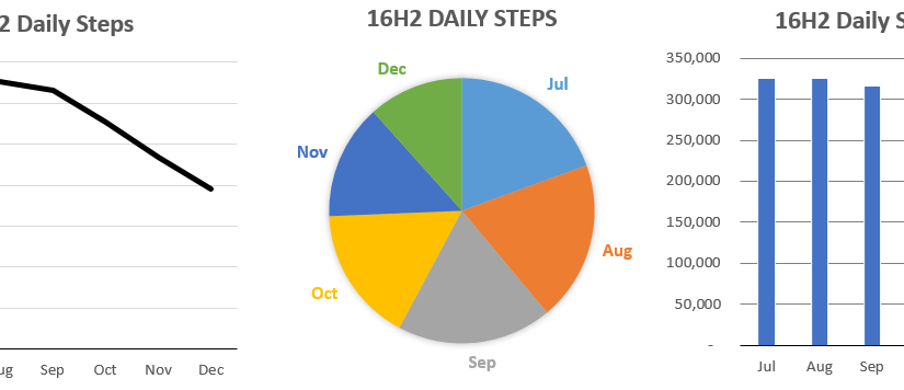
Excel can be a powerful tool for data analysis, but sometimes it’s easier to understand in a visual format. There are four main graphs that you can use in Excel: the line graph, pie chart, bar/column chart and the combo chart.
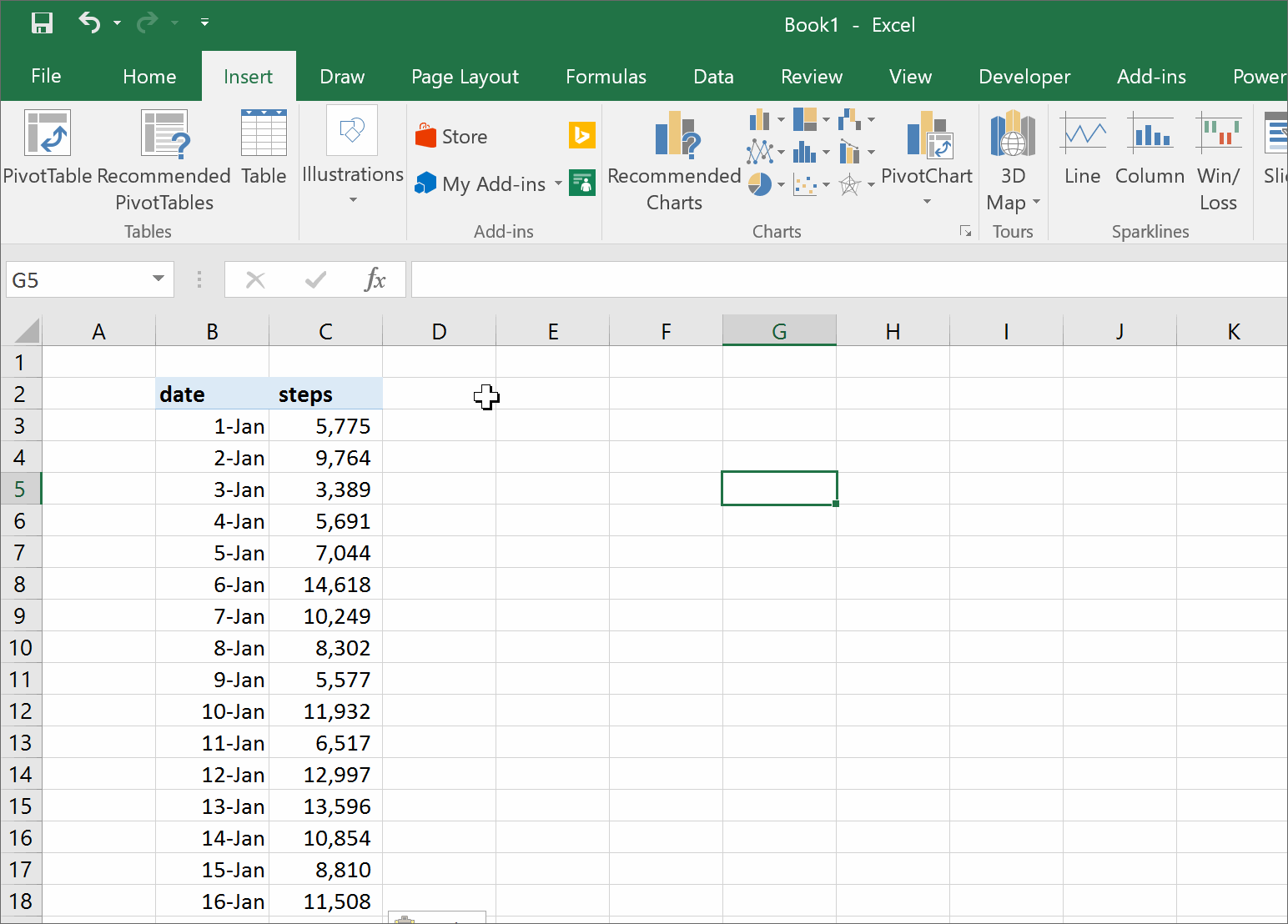
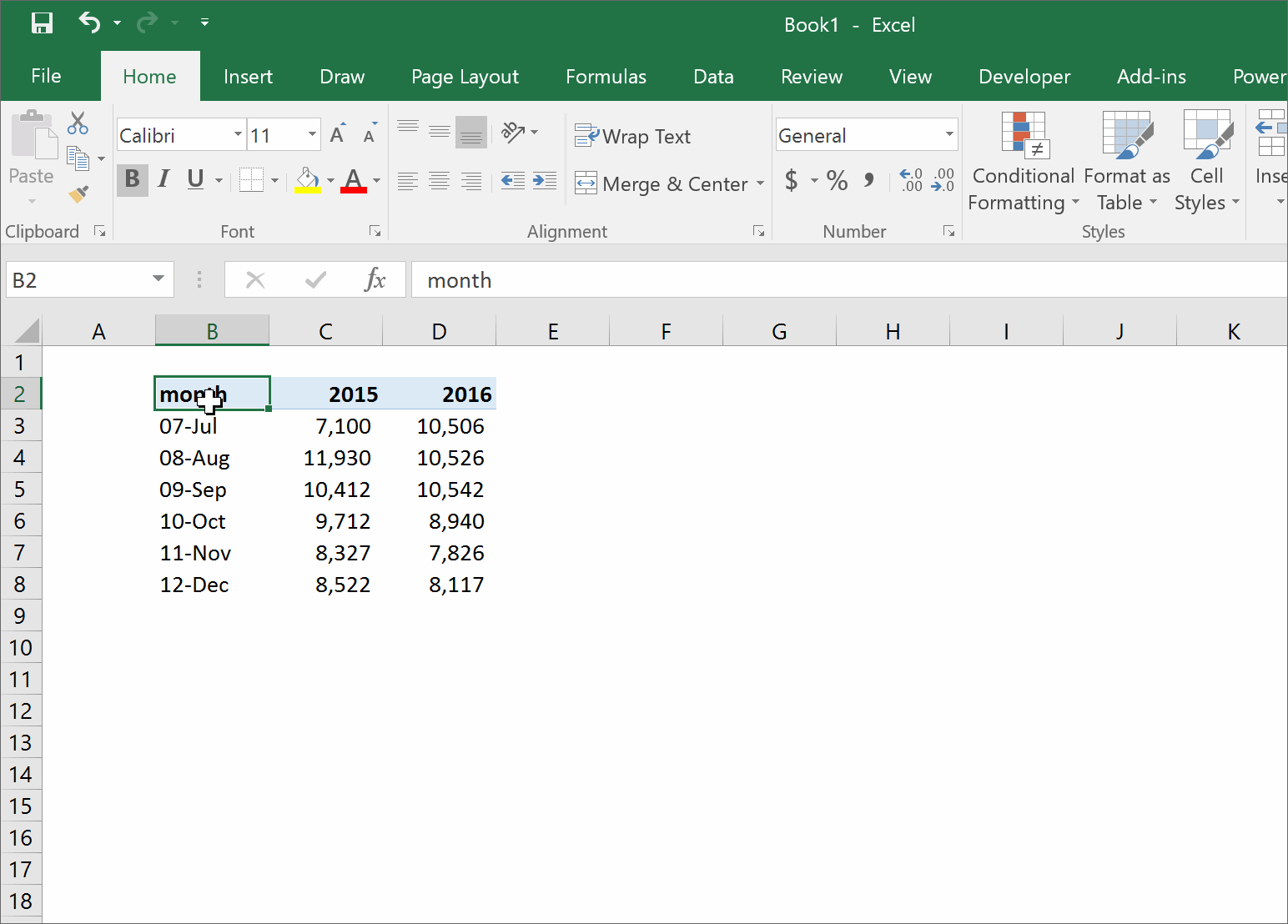
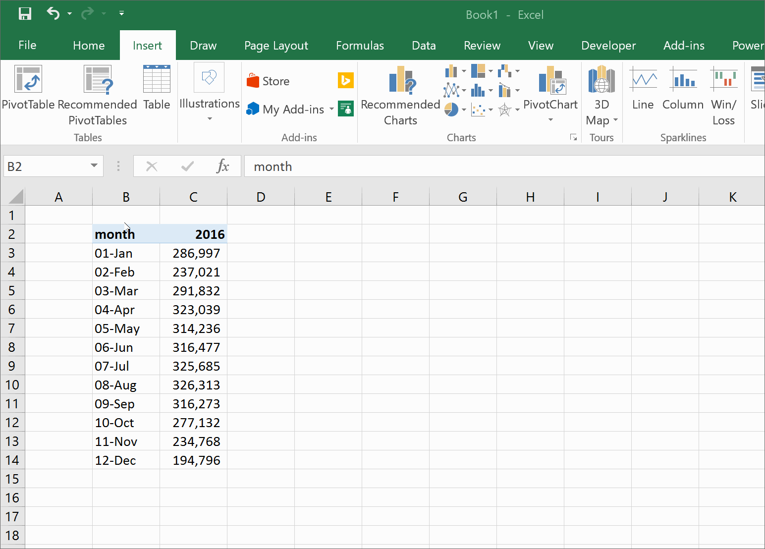
To make a graph in excel, you need to have the data in specific format. An example I use in the videos below are months in one column, and steps in the column next to it.
- Enter data into Excel
- Highlight the data you want to graph
- Click the insert section of the ribbon menu
- The section marked “Charts” will present you with several options
- Format the graph by right clicking the axis/color/title/legend that you want to change
Line Graph
Line graphs are used to show how an item has changed over the course of time. The x-axis (the horizontal one) is typically a time period like a day, month or year.
Column/Bar
A bar chart (sometimes referred to as a column chart) is used to compare data across different categories.
Pie Chart
Pie charts are used to show an item’s size in a group of items. An example is a sales team who wants to see which salesperson brought in the largest amount of revenue. A larger slice of the pie will show that person’s contribution.
As a general rule of thumb, ie charts can only be used if every number is positive, and if the numbers can be added into a total. This means, we couldn’t visualize a P&L (profit and loss statement) in a pie chart, because we would be mixing positive (revenue) and negative (operating expenses and costs of sales). Pie charts also can’t be used with numbers that can’t be added together. Temperatures are a good example, if we had a list of the average temperature for each month in 1999, it wouldn’t make sense to add them together. HOWEVER, if we could the number of days a temperatures fell into a certain range (ie 30-50, 51-70, 71-90) we could chart how many hot, cold, or mild days there were.