How to run 300 miles

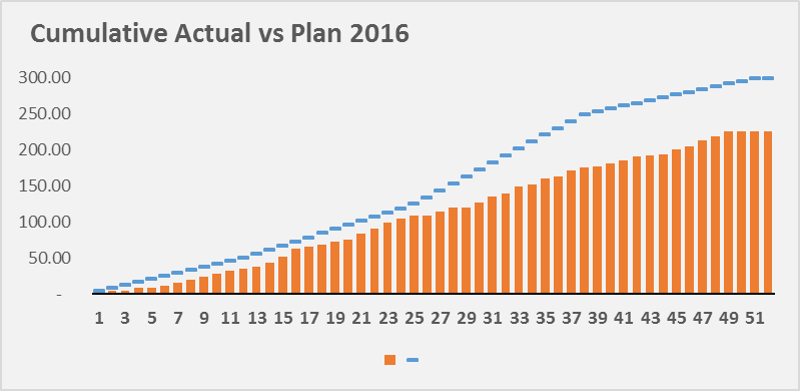
In January 2016, I set a goal for myself that I would run 300 miles in 2016.  This would be a 50 mile increase from 2015 – a year where I ran more than any year previous –  and an 80 mile increase from 2014.  The rules were simple, only running counted toward 300, of the miles run, they had to be recorded in the app, MapMyRun, warmups and cool-downs don’t count towards the mileage, and treadmill running doesn’t count unless it’s over 1.5 miles.

Setting Quarterly Goals

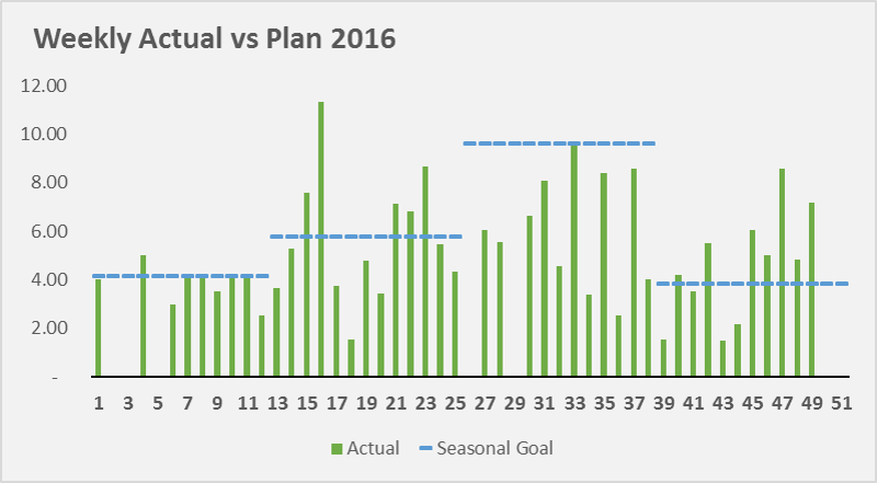
I knew from the start that it’s unlikely that I’ll run the same every week – temperature, daylight, and likelihood of injury all factor into my running decisions.  With this in mind, I set the following quarterly mile goals:  50, 75, 125, and 50 miles.  My rationale was simple, I have less of an opportunity to run in Q1 & Q4 because of weather and an early sunset.  Injury is a major concern too, if I go out to fast in Q1, I could injure myself and be out for a month.

My July – September goals were justified because of the same reasons as my Q1 goal.  From May to August, the sun sets after 7:30p, which allows me enough time to leave work and run 3+ miles.  This takes the burden off of weekends, which means that I’m not dependent on 2 out of 7 days for my ten mile weekly goal.  Also, longer days mean I don’t need use the gym treadmills where I run 2.5 miles before getting too bored to finish.

Reality vs Goals

Part of this post is to be honest with myself.  Even though I modeled this down to the week, I still fell well short of my goal.  To avoid failing again, we need to learn from my mistakes.

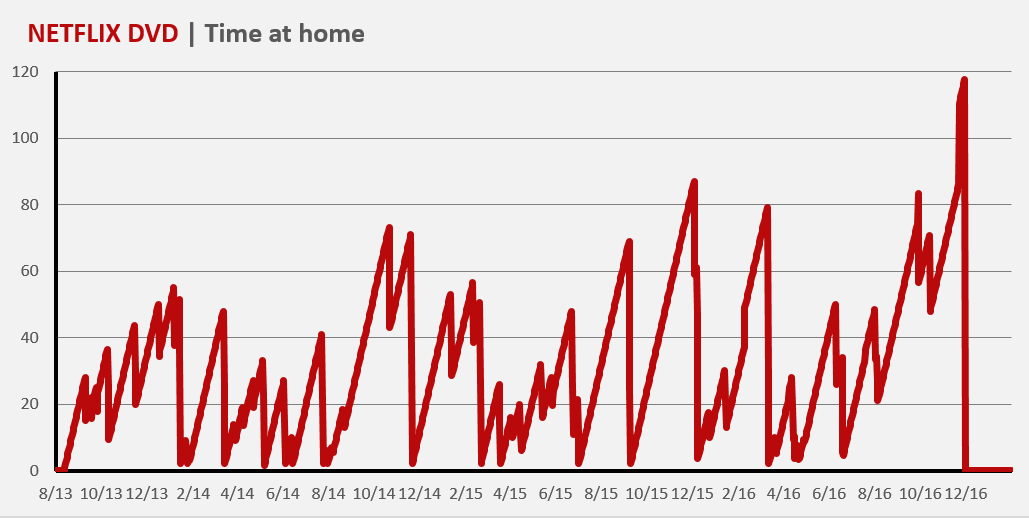
We can see that my actual running in Q1 fell short of what I thought was possible.  This is the result of several factors: weather and work.  Jan and Feb were pretty brutal, there was a “blizzard” the first week of February which prevented my from running most of Feb.

Q3 was the biggest reason I missed my goal.  In January I set a personal goal of 125 miles over a 13 week span.  In theory this was easy to achieve, I would need to run 10 miles a week, or run 3.33 miles three times a week (probably Wednesday, Saturday and another date).  In reality I wasn’t able to meet this goal, for reasons I’m still trying to understand.  Part of it may be related to my personal life, I went on more dates on weekdays and weekends.  Another reason may be the 3 mile races I competed in every Wednesday.  These races were tough, and I felt like I had to rest for several days to recover from the races.

Next Steps

Since I didn’t run 300 miles last year I’ve decided to fulfill this goal in 2017.  I’ll need to learn from the mistakes of 2016, and be more proactive in Q3 when the goal is higher.  I’ll also need to determine if I’ll accomplish this with a lot of short runs (1.5 – 3 miles), or longer runs 4 miles.  I’ve entertained the idea of training for a half-marathon to accomplish this with less runs, but I prefer to keep my training (and racees) under 6 miles per run.

VLOOKUP Tutorial and 3 Easy Tips

VLOOKUP and how you should it

Summary

The vlookup Excel formula searches your data for a keyword and returns a value instantly.  Think of how you order at Starbucks: If I want to know how much an Iced 

Coffee costs, I would find the Iced Coffee on the menu (2nd from the top), and


look to the right to see that a small costs $2.25.  Excel does the same thing, except it can search 100,000 items, in the same amount of time it takes you to search through 10.

Real Life Examples

Lets keep using the Starbucks menu for this example.  We want to know how much a White Chocolate Mocha would cost if we purchased the Grande size.  In this example, the “lookup_value” is in cell A12 ‘White Chocolate Mocha’, the “table_array” is A2:D9, the “col_index_num” is 3 and “[Range lookup]” is false. What vlookup is doing, is searching for ‘White Chocolate Mocha’ in the table we highlighted in red, and looking at the third column.  If we wanted the price of a Venti, we would have used 4 instead of 3 as the “col_index_num”.

IMPORTANT NOTE:  “lookup_value” aka White Chocolate Mocha always needs to be in the first column in the table.

Common Issues

  • You didn’t anchor your formulas.
    • If you copy the formula to the cell below, then the table array will also shift down one row.
    • To prevent this, highlight the table array in the formula bar, and press F4 (on Windows) to add anchors (signified by dollar signs).  This tells Excel not to move whatever you’ve anchored.
  • The thing you’re looking for shows up more than once.
    • When this happens, Excel returns the first thing it finds (going from top to bottom).
    • Avoid using names if possible (John, Sanjay, Allison) and try and use a full name or an ID number.  If I have data for multiple sales, there could be multiple salespeople named John.  Instead, if I wanted to know about a specific sale, I could see if there was an ID with the order.
    • If I’m more interested in the amount of money that Sales Rep John generated, I could use a different formula like Sumif() or sumifs().
  • Your “Find This” keyword, isn’t in the first column.
    • Always make sure that the table you’re searching from, includes the keyword as the first column.
  • Not using false as the [range_lookup]
  • The Find this doesn’t match the thing your searching for.  If you’re “Find This” term is “Jen”, but the value in the table is “Jenny”, “Jenn”, or Jennifer”, your vlookup won’t know how to find it.  Make sure the thing you look for uses the same names.

Next Steps

Once you’ve used the vlookup enough, you’ll notice that you want something more powerful.  This might mean you’re ready to move to the “index match” formula.

How often do I use Netflix DVD?

I recently cancelled my Netflix DVD subscription, which I wasn’t using as much as when I signed up in 2010.  Among my friends and coworkers, I’m one of the last people to use the service.  Before I canceled the subscription, I three years worth of Netflix send/return emails from my Gmail and cleaned the data in Excel.

So was Netflix DVD a good value?  In 2011-2012, it definitely was.  There were be nights where I’d watch a DVD the same day I received it in the mail, and mail it back the next morning.   But, as time went on, and I worked longer hours, I had less time to commit to movies.  All of a sudden, I didn’t want to commit 2-3 hours of my evening to a movie which demands my full attention.  My indifference to the DVD service started in August 2016.  In the graph below, we can see I stopped returning DVD’s almost entirely.

So what DVD’s spent the most time at home?

173 days: The Hateful Eight (June 10 – November 29 2017)

114 days: Her (July 30, 2014- November 20, 2014)

97 days: The Usual Suspects (October 10, 2013 – Jan 14, 2014)

93 days: Inside Llewyn Davis (November 20, 2014 – Feb. 20, 2015)

91 days: Paul (Sep 8, 2015 – Dec 7, 2015)

91 days: Foxcatcher (Sep 8, 2015 – Dec 7, 2015)

80 days: The Godfather (Dec 23, 2015 – Mar 11, 2016)

71 days: The Imitation Game (Aug 4, 2016 – Oct 13, 2016)

70 days: Nightcrawler (April 15, 2015 – June 23, 2015)


How do I make graphs in Excel?

Excel can be a powerful tool for data analysis, but sometimes it’s easier to understand in a visual format.  There are four main graphs that you can use in Excel: the line graph, pie chart, bar/column chart and the combo chart.

To make a graph in excel, you need to have the data in specific format.  An example I use in the videos below are months in one column, and steps in the column next to it.

  1. Enter data into Excel
  2. Highlight the data you want to graph
  3. Click the insert section of the ribbon menu
  4. The section marked “Charts” will present you with several options
  5. Format the graph by right clicking the axis/color/title/legend that you want to change

Line Graph

Line graphs are used to show how an item has changed over the course of time.   The x-axis (the horizontal one) is typically a time period like a day, month or year.


Column/Bar

A bar chart (sometimes referred to as a column chart) is used to compare data across different categories.

Pie Chart

Pie charts are used to show an item’s size in a group of items.  An example is a sales team who wants to see which salesperson brought in the largest amount of revenue.  A larger slice of the pie will show that person’s contribution.

As a general rule of thumb, ie charts can only be used if every number is positive, and if the numbers can be added into a total.  This means, we couldn’t visualize a P&L (profit and loss statement) in a pie chart, because we would be mixing positive (revenue) and negative (operating expenses and costs of sales).   Pie charts also can’t be used with numbers that can’t be added together.   Temperatures are a good example, if we had a list of the average temperature for each month in 1999, it wouldn’t make sense to add them together.  HOWEVER, if we could the number of days a temperatures fell into a certain range (ie 30-50, 51-70, 71-90) we could chart how many hot, cold, or mild days there were.

NYC Crime Data Analysis of 2015

One of my goals over the next year is to analyze more of the data freely available from New York City public agencies like the NYPD, 311, TLC, and MTA.

Today, I decided to analyze the NYPD’s dataset, the Seven Major Felonies for 2015 (or technically the first nine months of 2015).  I’m a big fan of the COMPSTAT releases available on the NYPD’s website, which break out crime into several categories, timeframes, locations, and shooting incidents and a comparison at the bottom of each PDF, comparing the current year against previous years (2016, 2001, 1998, 1993, 1990).  Today’s dataset is going to focus on the NYPD’s ‘seven major felonies: rape, murder, burglary, robbery, grand larceny, felony assault, and grand larceny of a motor vehicle.


The data can be found here.

Interesting Findings

Felony assaults are twice as likely to occur between midnight and 4am on Saturday and Sunday.

Staten Island has zero murders on Wednesday or Friday.

Bronx murders peak at 3pm, and 8pm, and 1am

Summer between midnight and 4am is when most robberies occur

8% of grand larcenies occur at noon


Murder (257)

This is category I find interesting because of the drop over the last 25 years.  In 1990, NYC once average a over 6 murders per day, and ended 1990 with 2,245, this number has plummeted to (only) 352 in 2015.  It’s difficult to say what caused this drop from a dataset perspective, but we are able to see trends in the 2015 data by layering on time, temperature and location.

One of my favorite quotes regarding the correlation between the murder rate and temperature came from former Queens resident 50 Cent.  On his album ‘Get Rich or Die Tryin’, he postulated, “They say summer time is the killing season, it’s hot out in this bitch, that’s a good enough reason“.  Fifty does seem to have a point, looking at the average number of murders that occur at a certain temperature, 75-80 degrees (Fahrenheit) is when murders peak at 45.

It’s difficult to say what causes the spike using only data, but we can make some guesses.  One guess is that people may be more likely with to go outside when there’s more daylight and warmer weather.  This could lead to more confrontations with friends/enemies/strangers.  Another guess would be the summer vacation schedule causes more teenagers to get into trouble, an ”.

BURGLARY (10,945)

The distribution of burglary seems to be dependent on time of day.  From 2pm-4am, each hour of the day will account for 5% of reported burglaries, but between 5am and 1pm, that number falls between 2-3%.  I don’t have information on the location of the burglary ie: Residential vs commercial, which would be useful to know who is affected, and if the location affects the reporting.  My guess is that it’s hard to determine whether these burglaries occurred at the time in the dataset, or if it’s when the NYPD received them.


RAPE (1,080)

This felony seems to be concentrated within several days and hours with several noticable spikes.  13% of rapes occur at midnight, in terms of weekday, Saturday and Sunday make up 18 and 17% respectively.  There are small spikes in the data at 4am, 8am, and noon.

Grand Larceny of a Motor Vehicle (5,515)

I’ve only briefly looked at this felony, but it appears that half occur between 6pm and midnight.  Breaking it out by month, 27% of GL’s were commited in August and September, while only 17% occured in January and February.


NYC Taxi Data 2015

The New York City department of Taxi and Limousines released data for every $2.5 billion and 187 million trips in 2015.  This dataset contains pickup time, location and dropoff coordinates, fare, tip amount and transaction type for 2015.


Interesting findings:

New Yorkers Aren’t Morning People

It’s pretty nice being a taxi driver these days.  On average, taxi drivers who were tipped, received an average tip of 20.0% (credit card transactions only).  The best tips occur between 4 – 5pm, that’s when drivers receive tips 5% higher than the 20.0% average.  Apparently, New Yorkers aren’t morning people, the worst time to drive a taxi is 7 – 8am, that’s when drivers recieve the lowest tips 4% lower than average.

Hourly Taxi Tips

54% of trips used a credit card

Since this analysis only looks at credit card trips, we see grouping around the pre-selected tip amounts in the creditcard reader of 15%, 20% and 25%.  It seems that 20% is the most selected tip amount: 42% of tips were between 19 – 22%.

Tip Histogram

Source:

NYC Taxi Data | Google Big Query

Microsoft Excel (Graphs)