Are you new to Python and trying to make a beautiful graph? I’ve reviewed four of the most popular and picked the best option for beginners. For the cells below, I used Jupyer Notebook with these modules that can be installed via pip (pandas, numpy, plotly, cufflinks, seaborn, chartify).
In a normal day, I’ll open my Jupyter Notebook, import a CSV that I created using SQL/Hive.
remember, this doesn't go in jupyter notebook, it goes in your terminal (the thing with a black screen, sort of looks like that thing from The Matrix)

pip install plotly
pip install cufflinks
pip install chartify
pip install seaborn
import pandas as pd
import numpy as np

%matplotlib inline

import pandas as pd


%cd -q Downloads
#%cd this changes my directory to the Downloads folder

df1=pd.read_csv('blog_example.csv')
#this uses pandas (pd) to read the csv in the Downloads folder
#this example data mimics Google Ad Manager data, but for this exercise, it's full of random numbers

df2=df1.pivot_table(values='imps',index='day',columns='subset',aggfunc='sum')
#I now have two dataframes: df1, df2. This will be used later, depending on the graph

df2.head()
#.head() will show the first five rows of df2
Download example data here.
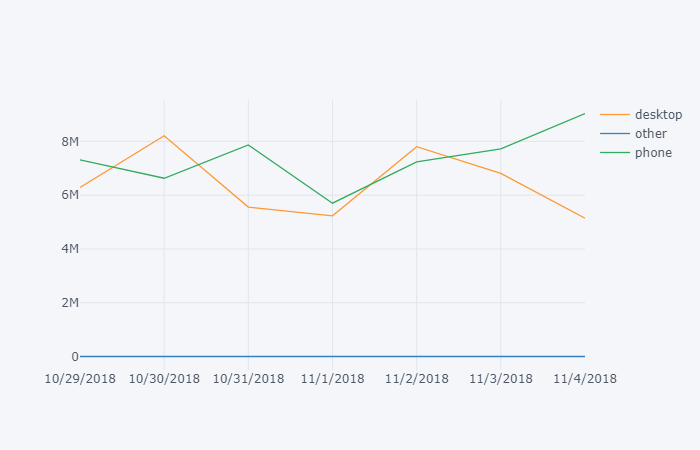
Plot.ly
Learning Curve: Low, my pick for best graphing module for beginners.
What I like: Interactive, easiest library to use for beginners, pretty themes out of the box, other features (export, save as png), easy to understand documentation for new users.

What I don’t like: version 2.x is slow. If you don’t use cufflinks, this becomes one of the most difficult graphing libraries. Requires additional code to run in offline mode.
import plotly
import cufflinks as cf

cf.go_offline()
#cf.go_offline() allows you to use plotly in jupyter

df2.iplot()
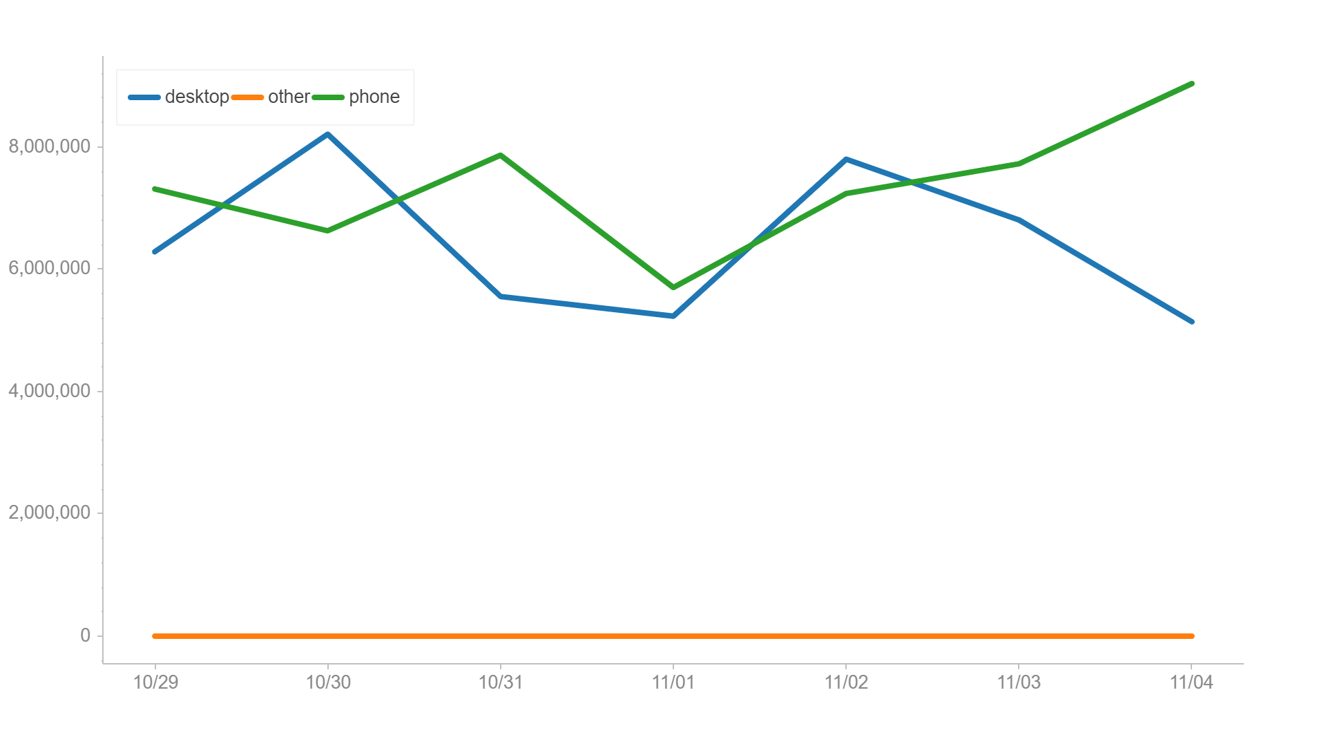
Chartify
What I like: Easy to write, built by Spotify Data Science team.

What I don’t like: Requires an additional exe to run (from Google).
import chartify
df=df1.groupby(['day','subset'],as_index=False).sum()
#chartify can handle a flat table, no need to pivot it

%cd -q
#%cd was needed to change the active directory to 'python', earlier in this lesson I moved it to the Downloads folder.

ch = chartify.Chart(blank_labels=True, x_axis_type='datetime')

ch.plot.line(
    data_frame=df,
    x_column='day'
    ,y_column='imps'
    ,color_column='subset'
)
ch.show()
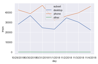
Seaborn
pip install seaborn
sns.set()
#sns.set is optional, but I like the formatting
sns.lineplot(x='day',y='imps',hue='subset' ,data=df1,ci=None);
What I like: Pretty visualizations out of the box, great at heatmaps.

What I don’t like: I’ve personally had trouble writing
and remembering the formatting of the plotting functions.
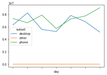
Matplotlib
pip install matplotlib

df1.plot()
Learning Curve:
What I like: Customizable, lots of documentation on StackOverflow
What I don’t like: Difficult to remember all the features. Learning curve is prohibitive to new users.